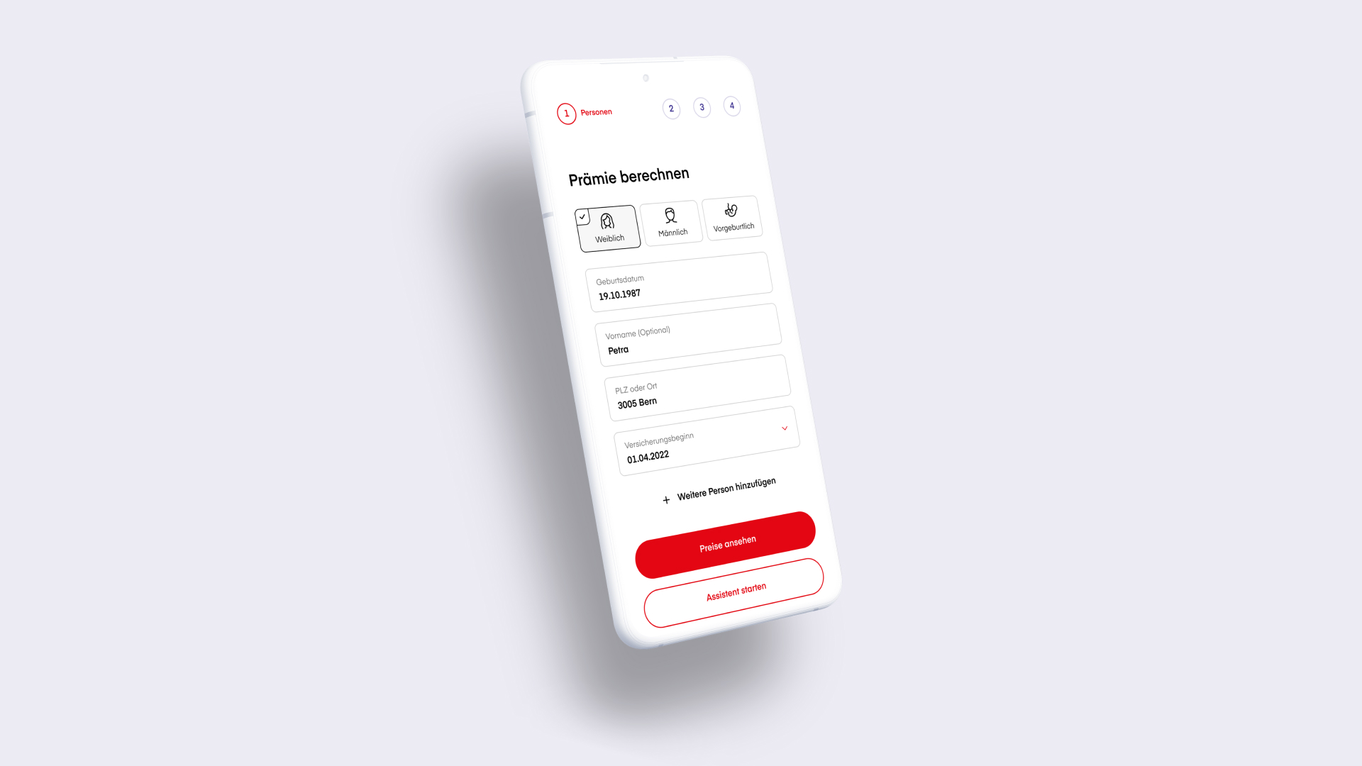
To meet the growing need for more digital and self-service options for health insurance, we worked with Visana to develop a new, highly intuitive calculator that helps users determine which plan is right for them, how much their premiums will be, and what their coverage includes.
Presenting complicated ideas, simply
Finding the insurance options that fit your healthcare needs isn’t always easy. Customers can quickly become overwhelmed without personalized advice from experts, especially when using an online portal.
Our strategy was rooted in providing clear and precise user guidance for customers. The new premium calculator we helped build for Visana is a prime example of this: Taking complex insurance benefits and presenting them in a simple and understandable way to ensure users are making informed choices.
User-centered from start to finish
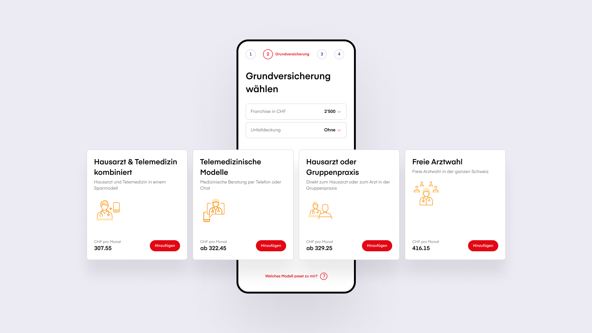
To boost usability, we made sure to offer guidance to users every step of the way within an otherwise complex process, from understanding the differences between insurance plans to determining which would suit them best.
Additionally, clear interaction elements and simple orientation aids ensure that users navigate safely through all relevant steps without losing track of where they are within the overall process.
Accessible from home and on the go
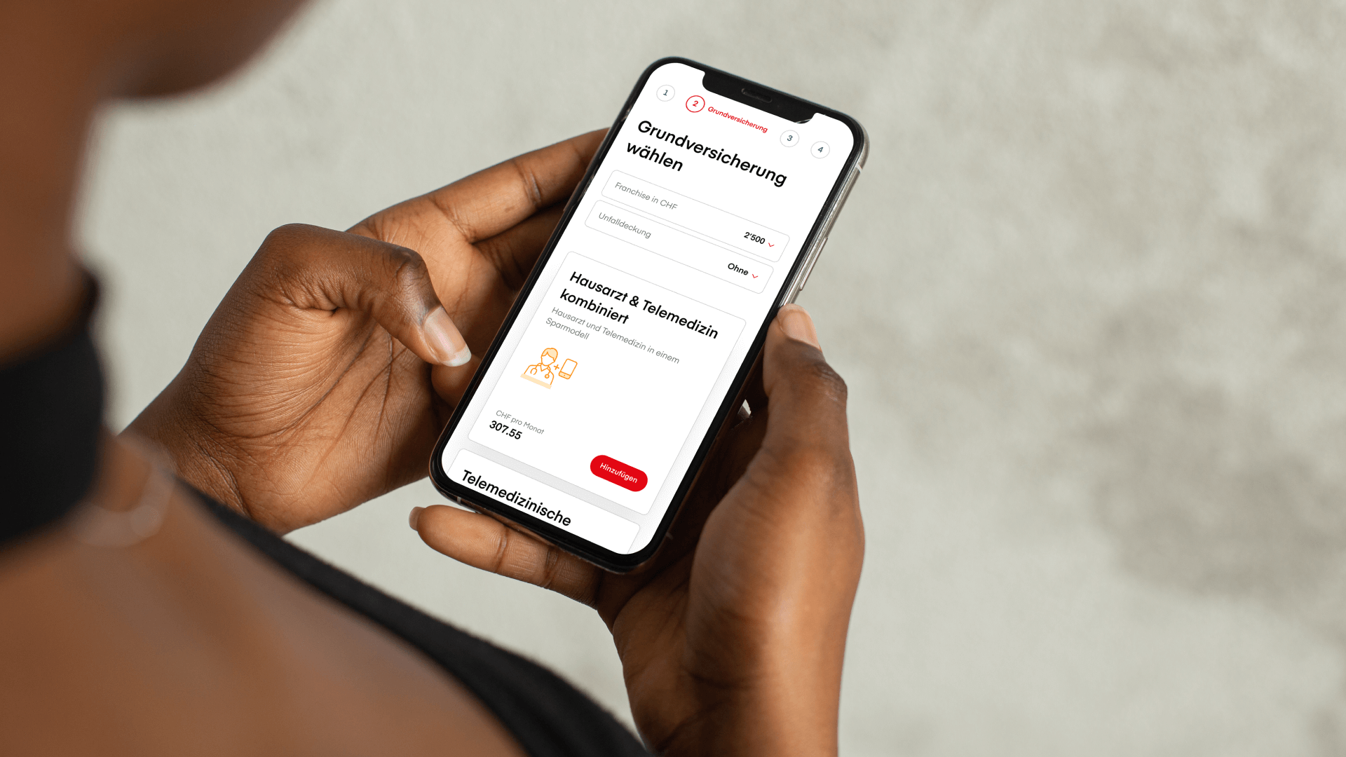
If you can order new shoes anywhere at any time, you should also be able to choose new health insurance just as quickly and easily.
That’s why we went with a mobile-first approach for Visana’s calculator, optimizing the user interface use on smaller screens. That said, thanks to its responsive design, the modular structure of the Visana premium calculator dynamically adapts to all screen sizes.
No matter what type of device customers are using, this design ensures hand-friendly operation—enabling Visana customers to easily change their health insurance model whether they’re at home or on the go.
Clear design for informed decision-making
While we wanted to make sure customers had the guidance they needed, we also didn’t want to overwhelm them.
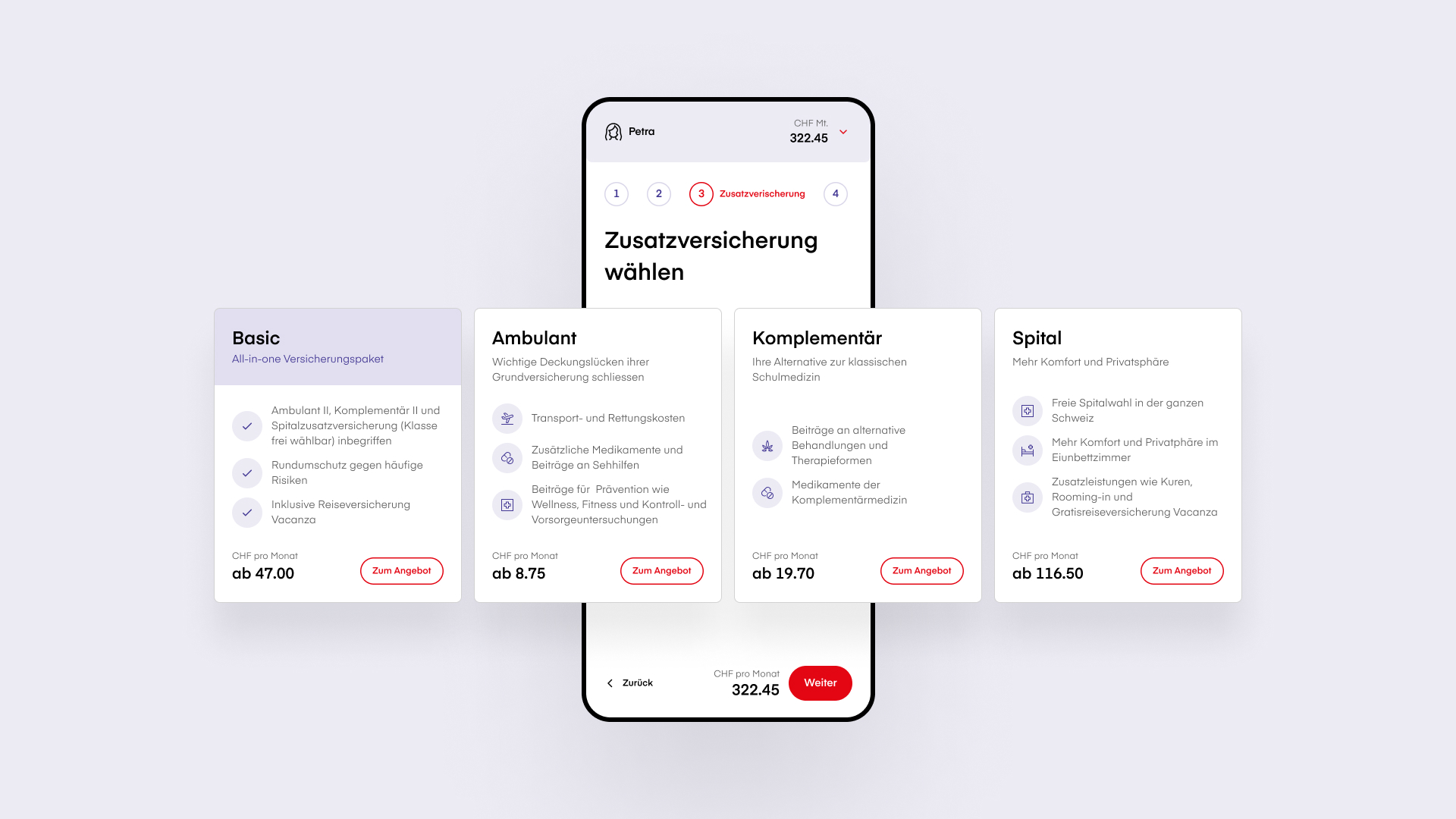
Operating by the principle of “as much information as necessary, as little information as possible,” we found the perfect amount of description for each of Visana’s health insurance plans.
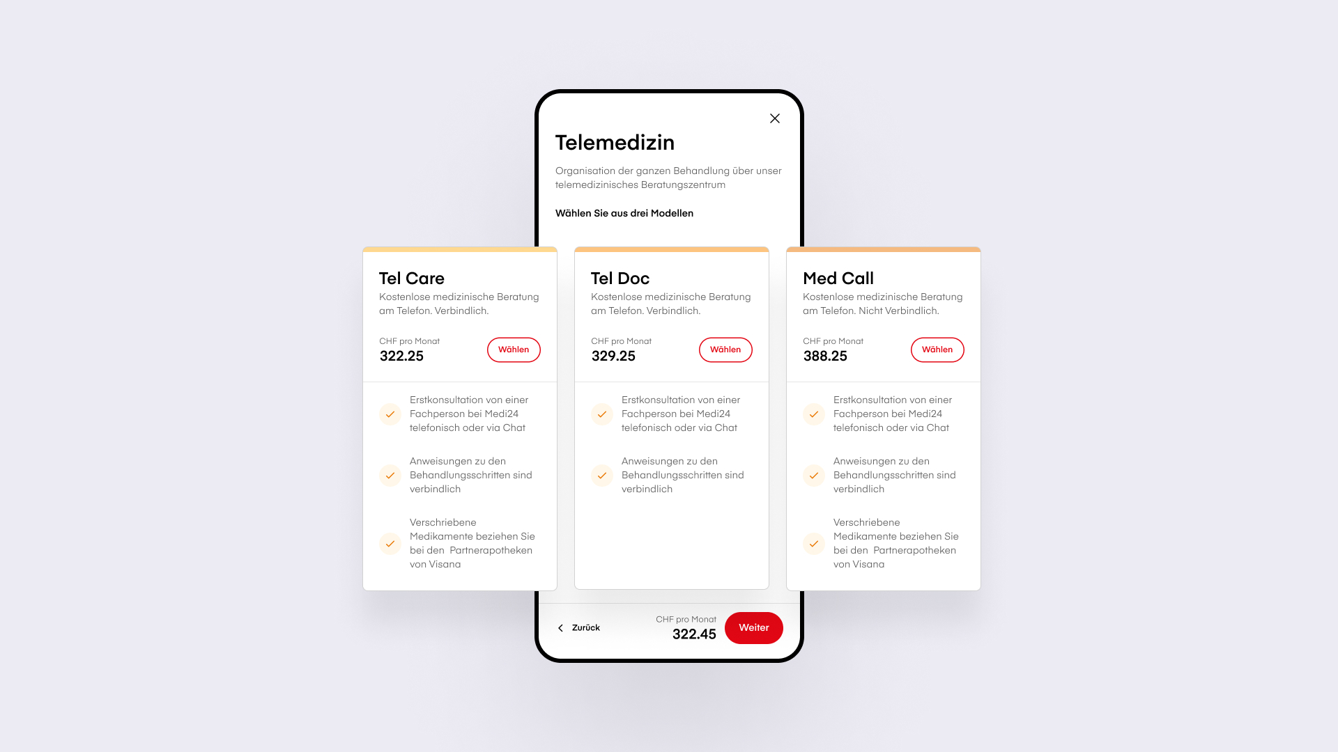
By filtering out unnecessary details, we helped users find the most important information about each plan quickly and with as little navigation as possible.
For users who wanted to dig deeper into the specifics of different plans, we created a separate overlay containing additional information.
Overview is everything
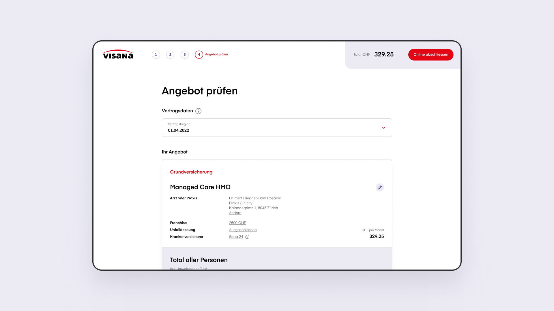
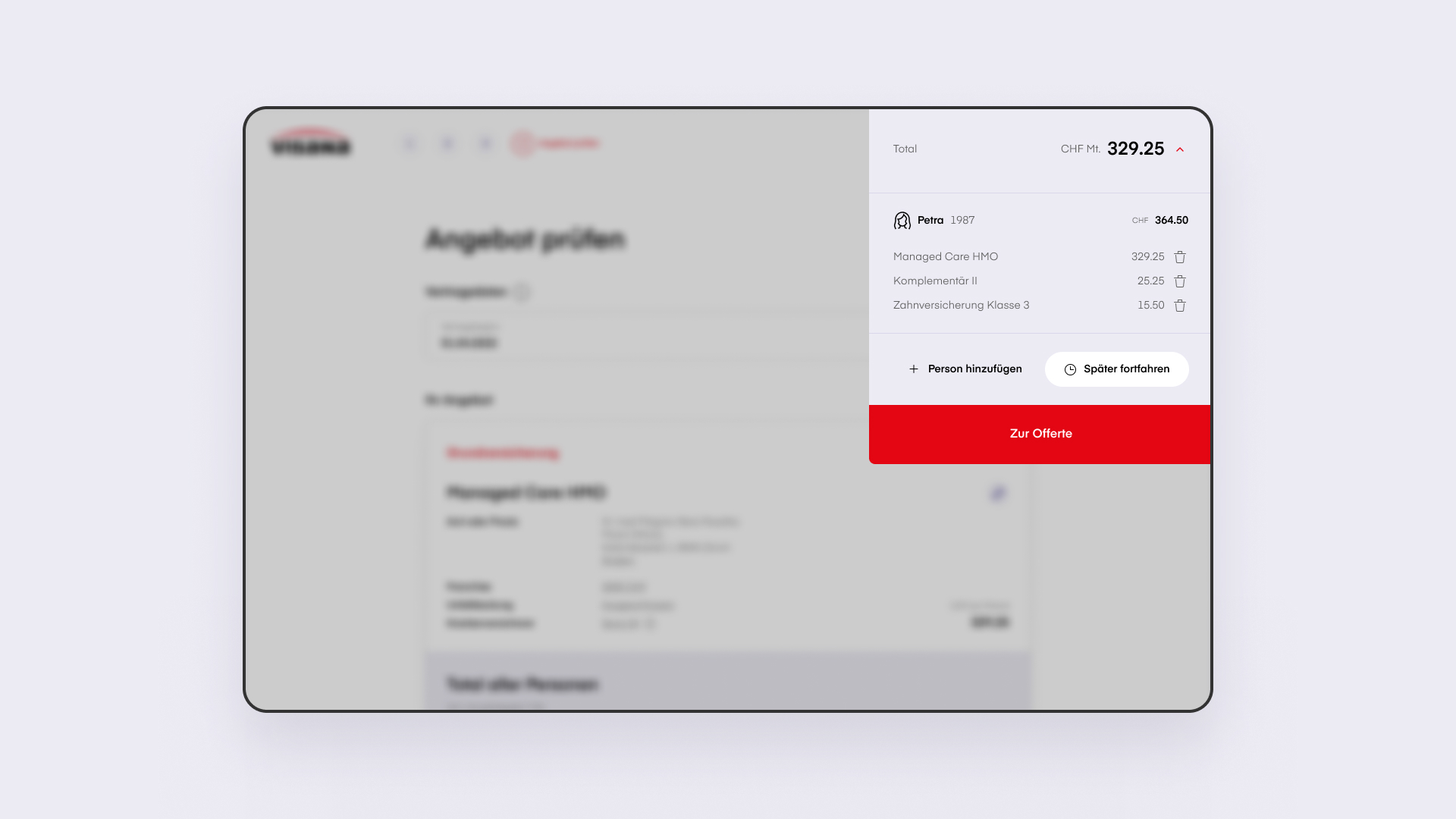
Maintaining an overview of the complex world of health insurance is crucial to not losing users.
By breaking down the health insurance process into steps that correspond to those within a standard e-commerce experience and providing a concise overview of their final purchase, we helped ensure every Visana customer has a better, more complete understanding of their insurance plan, costs, and coverage.
Discover the Website
Questions?
Director Business Development
Yann Wanner
Questions?
Director Business Development


