Raleigh chooses a new path and launches bold brand campaign
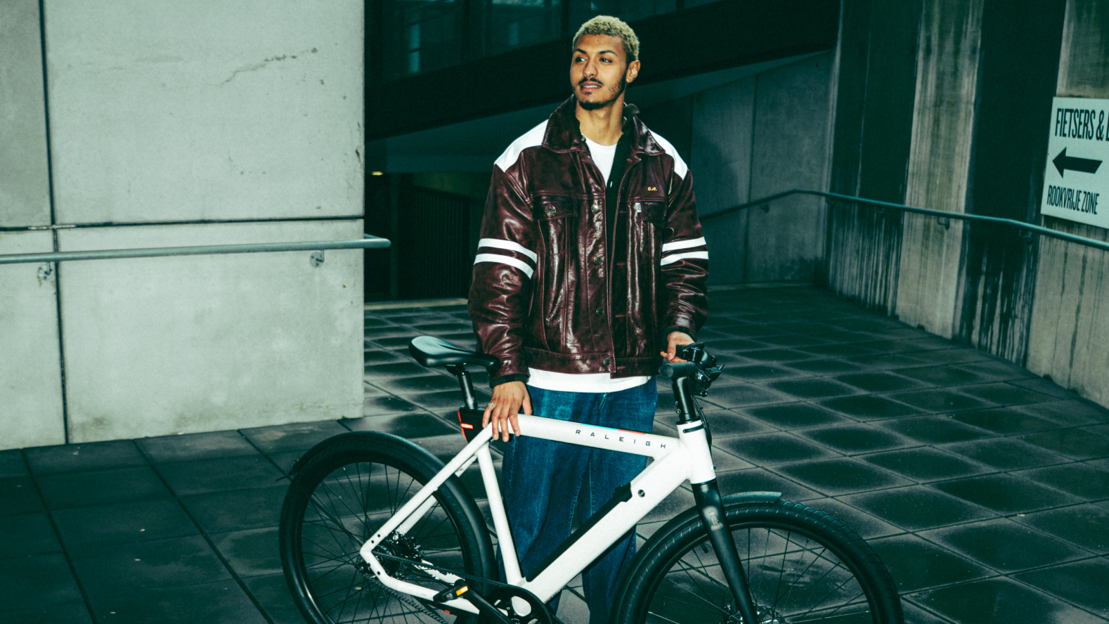
DEPT® brings the iconic bicycle brand back to the now.
Raleigh, the iconic British bicycle brand that has been shaping the streets since 1887, kicks off a new chapter. In collaboration with digital agency DEPT®, the brand is launching an entirely new brand platform, including a European campaign centered around the electric Raleigh ONE. The launch brings everything together: a fresh visual style, a clear positioning, and a hefty dose of character.
Raleigh is not about the past or the future, but about the feeling of now. For over 130 years, the brand has made bikes that do more than get people from A to B: they move culture. In a world of dull frames and tech-speak, Raleigh could have blended into the crowd. But instead of riding along with trends, the brand once again chose individuality. With this refresh, Raleigh shows how a classic brand can be right at home in the present.
Raleigh reimagined
The new brand platform consists of three pillars: a strategic repositioning, a visual identity, and a new campaign concept. The refreshed look breathes modern heritage: familiar, but fresh. The logo has been modernized, with the iconic heron once again taking center stage. The colours nod to the past but leap off the screen. Typography, visual language, and tone convey personality, boldness, and recognizability.
The city as canvas
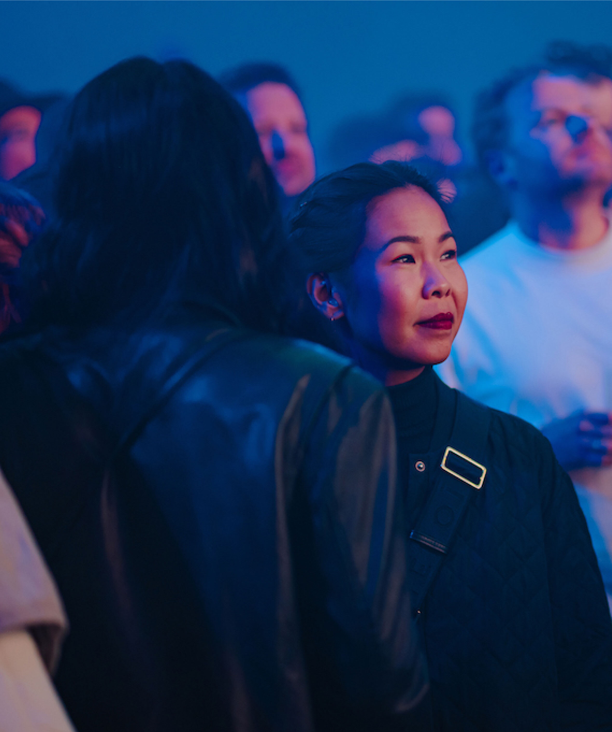
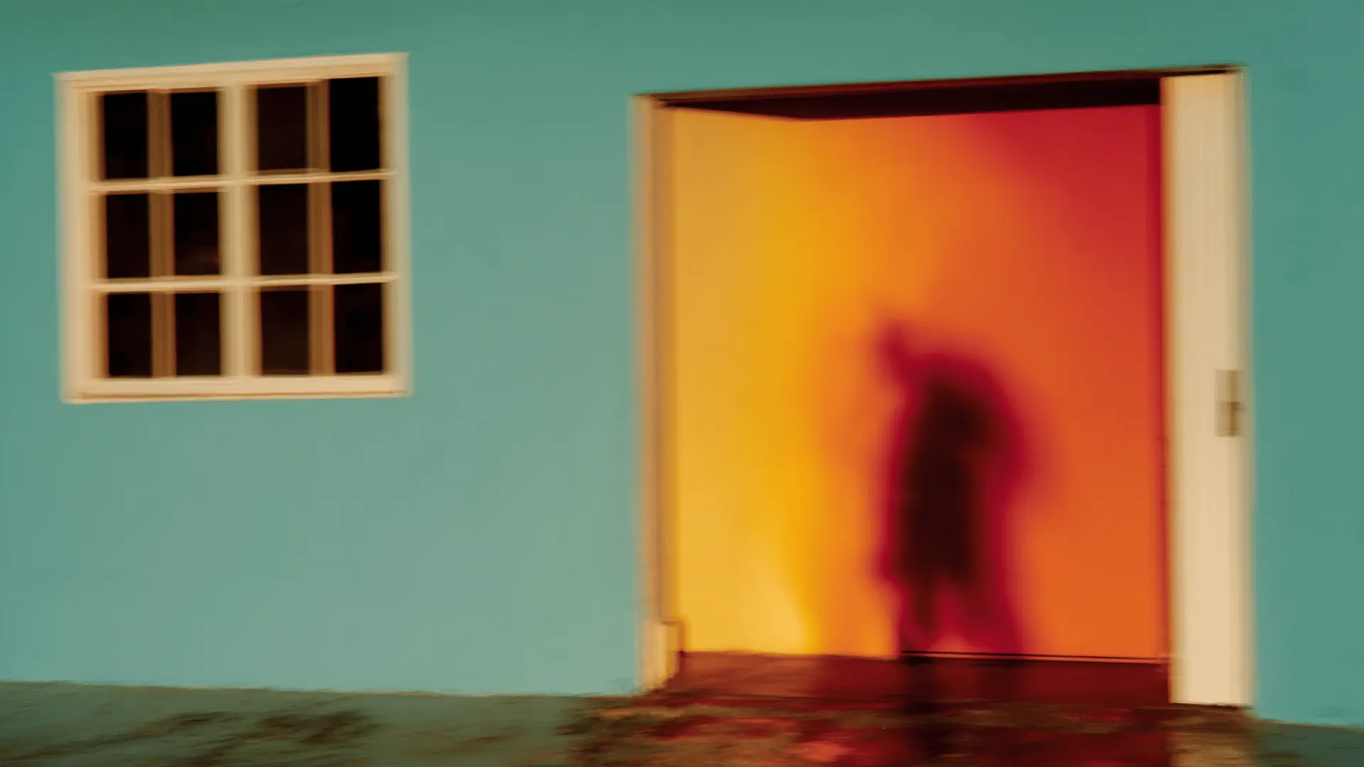
At the heart of the campaign is the new e-bike: Raleigh ONE. The campaign film brings the Raleigh ONE to life in a visual journey through neighborhoods, styles, cultures, and eras, with the city as a dynamic canvas. Not a story with a beginning and end, but a ride full of energy, diversity, and emotion. Director Kelvin Jones is known for his raw, emotional style and captured the brand’s energy flawlessly. Cinematography is by Ben Cotgrove, an award-winning cinematographer whose imagery gives the campaign character and depth. The production was done in collaboration with Amsterdam-based production house 100%, with sound design by Audentity and editing by Trim Editing.
“This repositioning is about more than just a fresh look. We wanted an identity that moves forward, while staying true to Raleigh’s DNA and heritage. In collaboration with DEPT®, we worked on a clear brand story, a visual style with character, and a campaign that makes it all tangible. Everything comes together in this new chapter.
”Barry Schmits, Global Brand Marketing at Accell Group (Raleigh’s parent company)
“Raleigh is character. Not a marketing construct, but a brand that chooses its own path. The rebranding and new brand film reflect that feeling. This project gave us the opportunity to bring strategy, design and storytelling together seamlessly. And after six years of working together, this felt like the right time to present Raleigh in all its strength.
”Lucas Nutbey, SVP of Strategy EMEA at DEPT®
A new look in motion
The rebranding consists of a brand film, photography, visual identity and corresponding brand documentation. All expressions are built from a clear system, allowing Raleigh to position itself strongly and consistently across every channel.
