
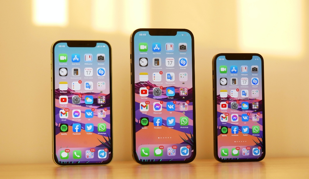

Mobile internet usage surpassed desktop usage in 2016, a trend that’s only continued to grow.
Most people have probably experienced a similar transition in their own day-to-days. These days, generally speaking, folks everywhere tend to use their phones and tablets more hours in the day than they use their laptops.
This shift has had important implications for those designing software, putting a new emphasis on mobile design that’s resulted in a series of design techniques collectively called “mobile-first design.”
If you’re responsible for a software experience, how can you use this approach to ensure your mobile design is the best it can be?
What is mobile-first design?
Designing with a mobile-first approach makes the most of what a mobile device has to offer by going against the traditional direction of web design.
Before mobile became the dominant way folks interacted with the internet, designers generally worked large to small; desktop to tablet to smartphone. Hardly surprising, given that the desktop long preceded the mobile phone and the iPhone didn’t debut until 2007.
Nowadays, given the current ubiquity of smartphones, designers generally work small to large; starting from the pocket-sized screen and scaling up from there.
This approach forces designers to work with the most limited real estate first, on the screen size users will likely use most. Instead of paring down a desktop design to fit a mobile device, mobile-first designs are optimized for mobile devices and then expanded for desktop.
As a result, mobile-first design is the right approach for most software and web experiences today.
Thinking smaller means thinking smarter
Designing for mobile is a challenge that forces product designers to think practically and clearly define the components that make up the foundation of the UI and UX.
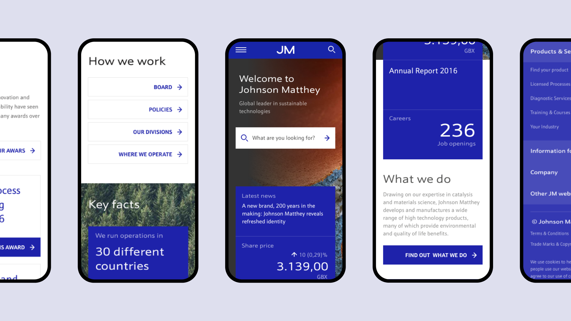
A navigation bar designed for mobile, for instance, is much more minimalist than a desktop nav. Smaller devices require comparatively larger touch targets to make buttons more easily clickable. Mobile devices are also most typically held in portrait orientation, shortening the navigation bar and reducing the available real estate even more.
With these limitations, a mobile navigation bar realistically can fit no more than three or four clearly defined components.
Thanks to the sneaky piece of design innovation known as the “hamburger menu,” however, it’s possible to create additional space for more without overcrowding the main navigation.
Just bear in mind that hiding something under a hamburger menu generally signifies it’s of lesser importance.
Mobile-first means content-first
Top of the list when tackling mobile design is content.
Users expect a mobile experience to contain the same content that they’d otherwise find in a desktop experience. At the same time, finding relevant content should also be just as intuitive.
A clear visual hierarchy of content is a must. Take advantage of different design elements, like high-contrast color palettes, negative space, and large, easy-to-read typography, to present to the user a logical flow of content.
Make it skimmable by trimming down word count and introducing short “above the fold” previews of content to help the user navigate to the content they need.
Organizing content into a hierarchy might be tricky. If it is, it’s helpful to take an inventory of what’s available in a spreadsheet (or even on sticky notes) and arrange those blocks into an order that reflects their relevance to the user.
Prioritize accessibility over looks
Think about the user and what their mobile specifications are.
What’s their demographic? Are they living in a more rural or urban area? Do they access mobile sites with a WiFi or data connection? Are they using an iOS or Android device?
In building a mobile education platform for ASU students in Kenya, for example, we had to tailor our approach to the technical requirements for learners in low bandwidth countries. Cutting-edge responsiveness, animation, and UX would simply not serve learners using a five-year-old Android device on high latency, low bandwidth network.
Prioritizing accessibility in mobile design doesn’t always require taking into account extreme disparities like those between college students in the US and Kenya.
Compressing images and using asynchronous loading to ensure that key content is displayed quickly—even if other portions of the design take a few seconds longer to appear—is another way of prioritizing accessibility for a user base made up of people who are on the go and experiencing slow connections.
Above all else, however, the best way to prioritize accessibility in a mobile design is through user testing. Putting a product in the hands of real users with real devices will help inform a design that works for everyone
Final thoughts on mobile-first design
A mobile-first approach benefits from a design principle known as “progressive enhancement.”
Mobile design might be challenging, but the nature of those challenges leads to an outcome that is accessible, intelligently designed, and puts the most essential content front & center.
Simply put, approaching design mobile-first creates an unbeatably solid foundation that makes enhancing for a larger device easy.
Considering a mobile-first approach for your product’s design? Learn more about our digital product design services and get in touch with one of our design experts.
More Insights?
View all Insights


Questions?
Writer