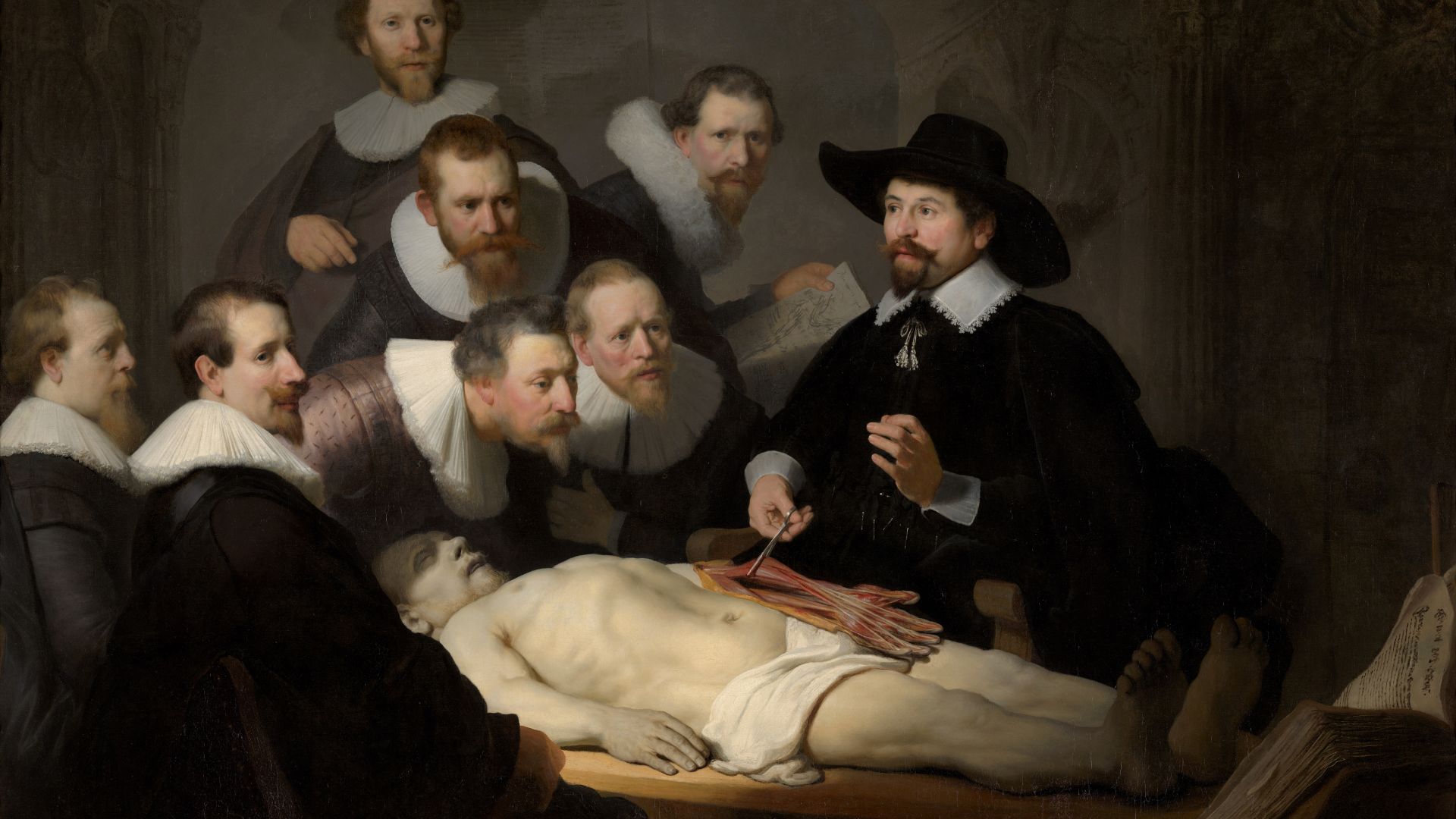
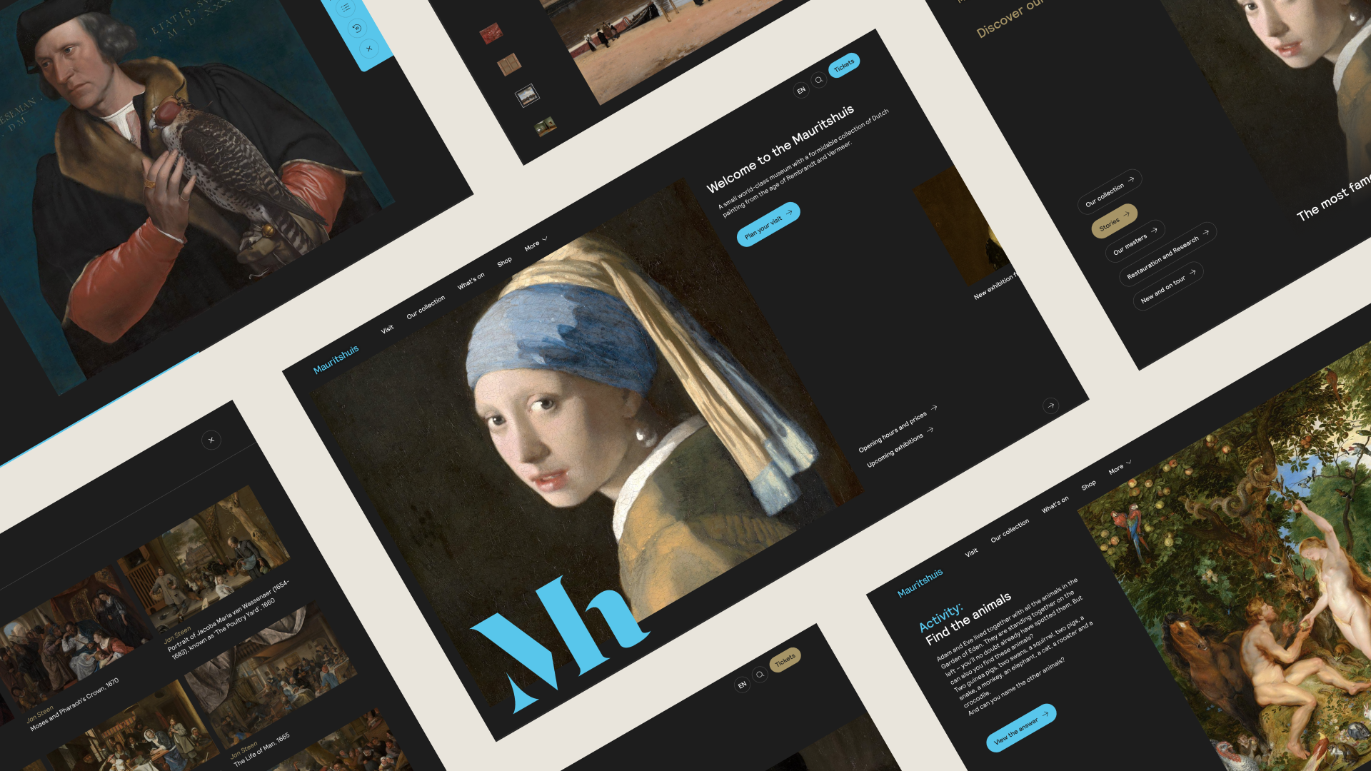
Filled with works of art from the eras of Rembrandt and Vermeer, the Mauritshuis has been attracting an audience of ‘real’ art lovers since it opened its doors in 1822.
With world famous paintings hanging in such a monumental building at the majestic Binnenhof in The Hague, everyone should be able to visit. Together with DEPT®, this finally became a possibility. We built a multimedia tour in the form of a new website and app, in which personalisation and perspective are paramount. In other words, a tour for everyone.
Smart personalization
The Mauritshuis knocked on our door asking us how to attract a broader audience within the Netherlands and beyond. Their goal was to diversify the audience in terms of education, age, nationality, socio-economic background and more by making the museum digitally accessible for everyone. We worked to find a way to introduce people from all over the world with different interests to the themes and paintings of the Mauritshuis. Our approach? Personalization.
However, this presented a challenge in terms of complexity. Automated personalization in the form of a website engine that serves different pages to different visitors, is put together on a technically complex level and asks for the use of data. This causes privacy sensitive issues and legislation, which conflicts with digital accessibility that the Mauritshuis strives for.
Instead, we opted to give visitors the option to personalize themselves, on the condition that the result is directly and perfectly tailored to the preferences of the visitor in question. While this solution solved a major problem, it still required a lot of content, particularly in the form of snippets that can be endlessly combined.
A content pyramid with differentiation through perspective
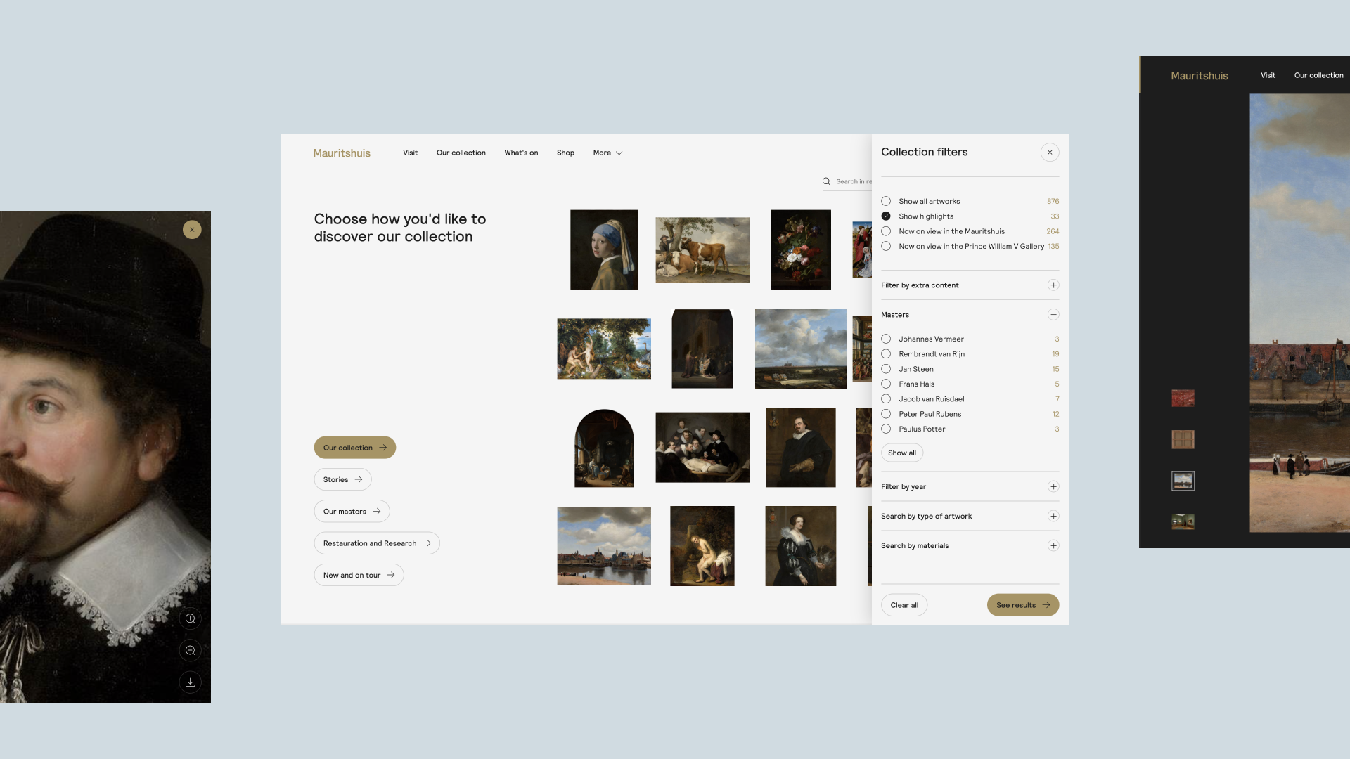
The Mauritshuis has at least 850 paintings and other works of art. In order to personalize these works and add structure, we created a content pyramid, divided as follows:
Collection
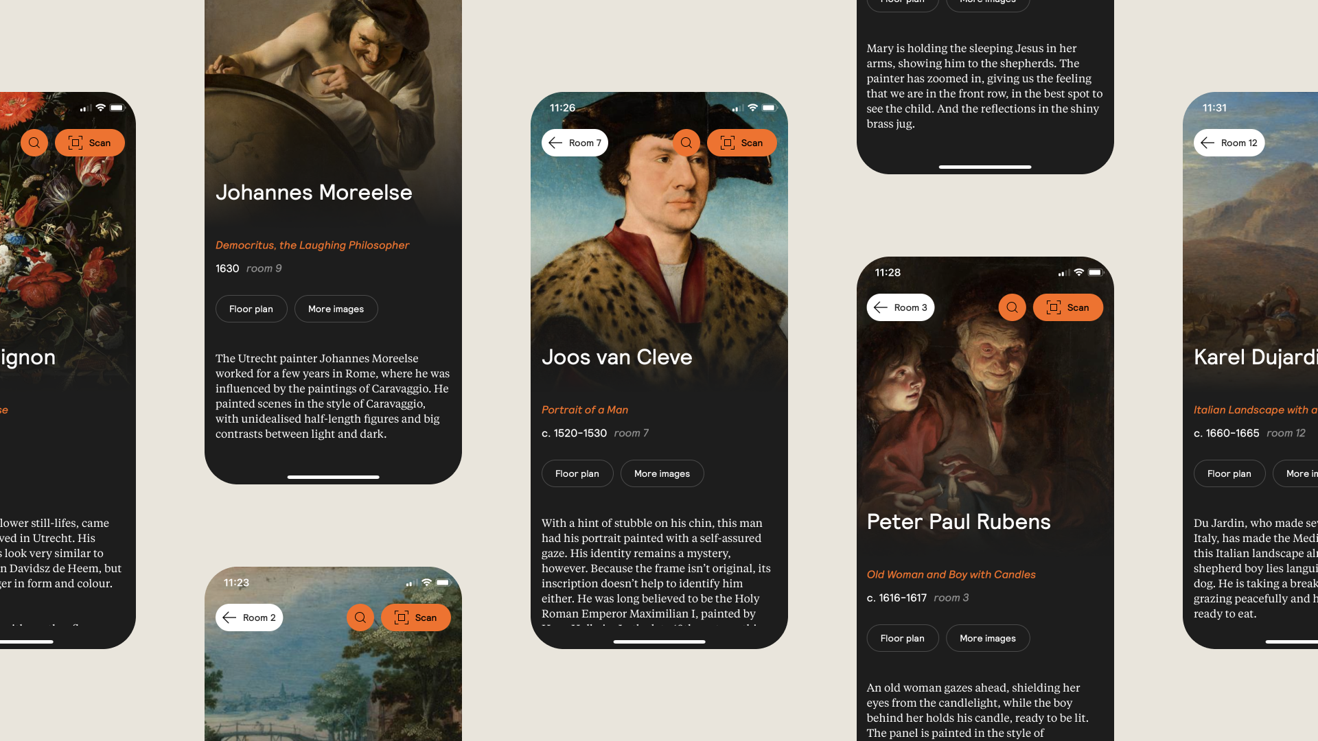
The Mauritshuis collection forms the base of the pyramid and is always available. This content layer contains the technical description of work, from title to artist, data, literature and extra images.
Context
The next layer is context. This provides the framework and thus the story on the basis of which paintings are viewed and understood. For example, if the collection focuses on the theme ‘animals’, the context could be ‘animals in Rembrandt’s time’, offering differentiation.
Perspective
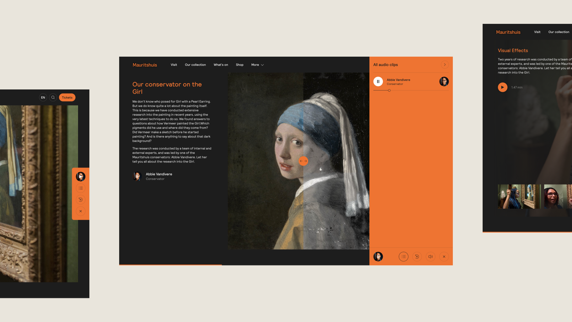
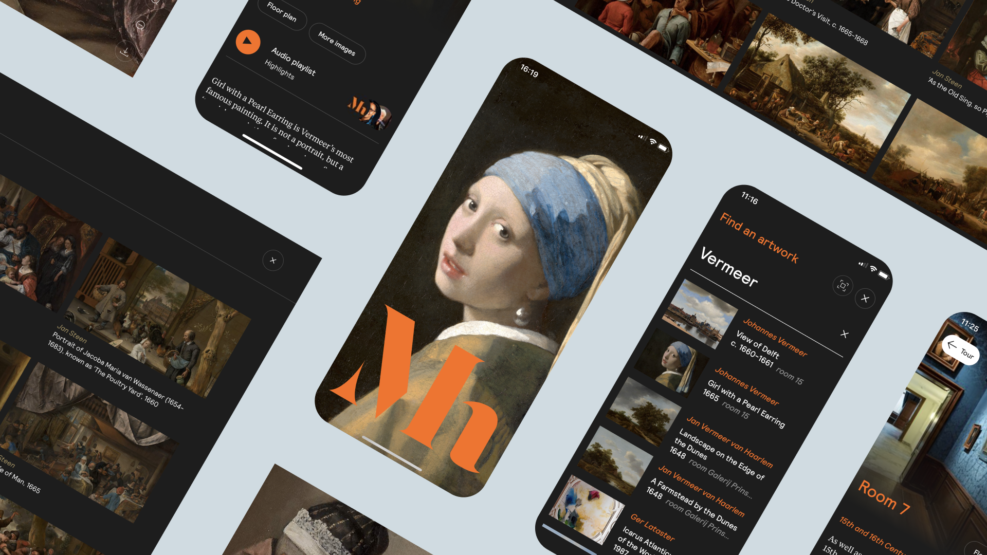
Finally, the top of the pyramid creates depth. This offers space to view and understand paintings and their stories from different angles. Here, for example, a historian explains, via an audio fragment, the symbolic meaning of animals in paintings, or Freek Vonk tells the younger audience fun facts about the depicted animal.
This pyramid allows Mauritshuis to play with the amount of content offered. The museum always makes use of the collection and provides context and differentiation through perspective.
Copy and content: website versus app
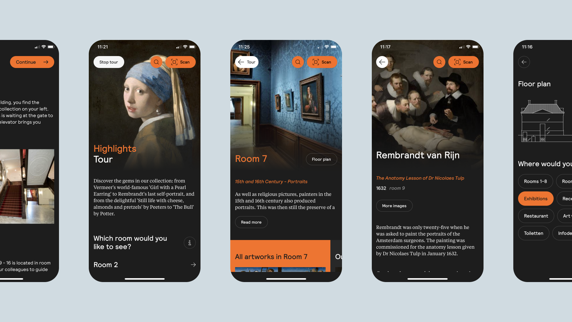
We took care to find a home for all of the content Mauritshuis has within the website and app. The website presents stories that have the same context for every visitor, and a number of audio options have been added to the paintings to highlight different perspectives. The app works in a similar way, but mainly serves to support a physical tour of the museum itself.
The big advantage of the content pyramid is that the same content can easily be sent to multiple platforms, producing a rich, well-rounded experience. However, we have chosen not to make the website and the app identical. Content that is relevant during a website visit is not necessarily what’s relevant when a visitor stands in front of a painting in the Mauritshuis. The museum likes to let its physical visitors immerse themselves in a painting instead of their phone, which is why the app only shows content that takes the user even more into the story of the painting in question.
We used the CMS system Umbraco to adjust the content. This gives the Mauritshuis complete freedom in managing and designing the content for both the website and the multimedia tour app. The link with the Adlib collection management system makes it possible to display the current Mauritshuis collection on the website.
Online & offline merge seamlessly
When someone visits the website and follows the multimedia tour in the museum, it is important that the experience flows smoothly from online to offline. We therefore made sure that the website and app have a lot of visual overlap and can be controlled with the same interface.
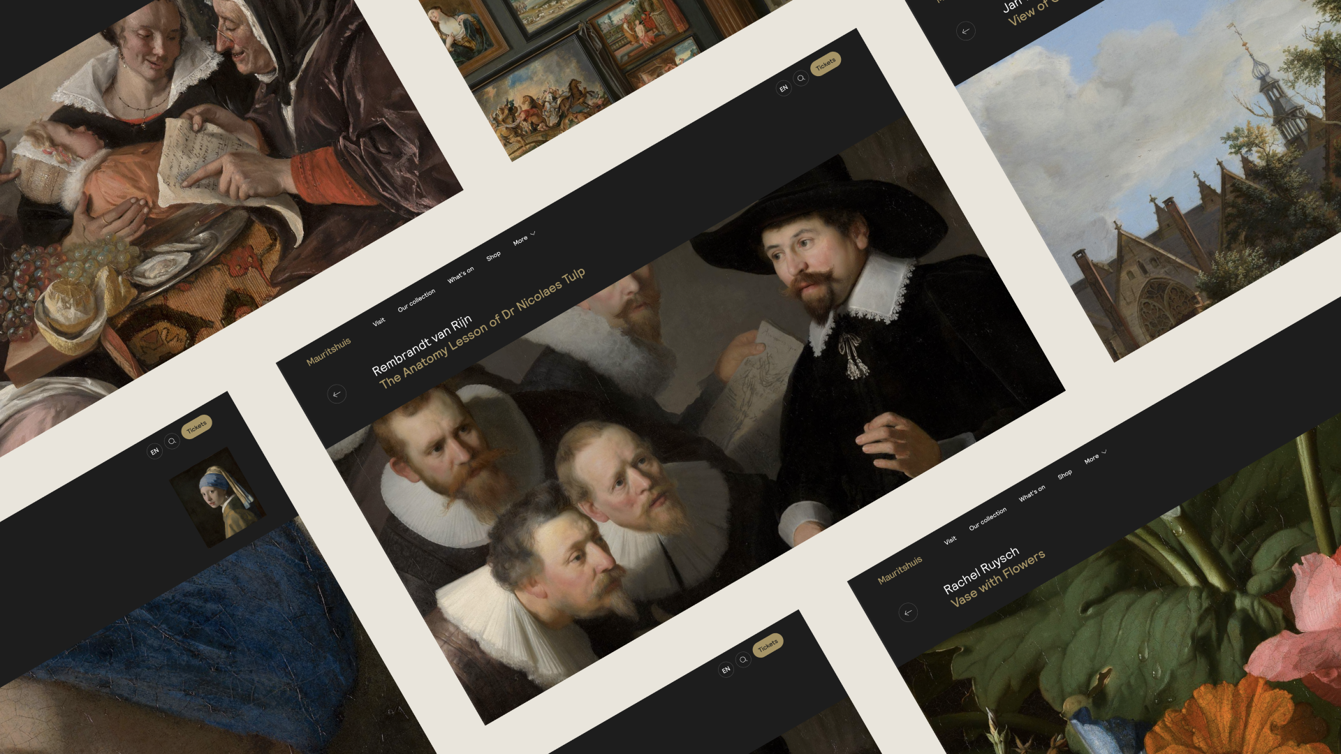
For example, the touch and feel of the multimedia tour forms a point of recognition for the visitor in all areas. Conversely, the experience of being physically present in the Mauritshuis has also been included in the design of the platforms. This is reflected, for example, in how the content is displayed, where there is room for exploration via horizontal scrolling. The content ‘hangs’ on the website from left to right, just like the paintings on the wall in the museum. By clicking on a certain piece of content, the visitor is given the space to literally and figuratively dive into the depths via vertical scrolling. Small details like this make a big difference.
Thanks to the new website and multimedia tour, we can tell all the stories behind our collection even better.
Test, test, test
The entire concept of the multimedia tour was initially based on the idea that the Mauritshuis sketched for us. This presented a challenge of great ideas that didn’t necessarily translate easily in reality. To overcome this, we carried out thorough tests throughout the project.
One of the main challenges was in the complexity of the historic building. In addition to the part visible from the outside, the museum also houses a large underground complex. The main goal here was to help visitors move through the museum as freely as a child without feeling lost. In the app, they can therefore choose between ‘free walking’ or a tour. If a visitor walks around freely, in the first concept they had the option of scanning a QR code next to a random painting. During testing, however, it turned out that visitors did not always keep enough distance from the precious paintings when scanning, which did not go over well with the security guards. As an alternative, we therefore opted for the option to scan the entire room, so that visitors can immediately see an overview of all paintings hanging in the room on their phone.
To further improve the visitor experience, it was necessary to think about how we would play the audio fragments. Of course, on an average busy day, it can be a nuisance when everyone is playing sound clips from their phones. Forcing visitors to use headphones can raise hygiene issues and as well as the challenge of fitting every phone port.
The solution? We enabled the audio fragment to be played through the ear speaker instead of the loudspeaker. This means that when the visitor holds their phone to their ear, they hear the audio clearly but the volume remains limited.
A digitally accessible museum for everyone
A strong digital programming has now been created. Sandra Verdel, project manager Digital Engagement at Mauritshuis said:
With the new website and multimedia tour, we want to position the Mauritshuis as a low-threshold, accessible museum, where you are personally touched by a collection that you must have seen once in your life. We want to do this by telling more stories ourselves, but also by letting others have their say about our collection. In addition, the new website forms the operating base for our new digital programming. We are very pleased that DEPT® is assisting us in all facets, from creativity to data and technology.
Since the website and app went live in September 2021, the Mauritshuis can proudly call itself a digitally accessible museum for everyone.
Experience the website
Questions?
UX Design & Research Lead