


One of the most common client questions our Conversion Rate Optimization (CRO) and Search Engine Optimization (SEO) teams get asked. “How do we write a competitor landing page?” These can be difficult to create for many marketers, as they must:
- Fully understand their own products’ value.
- Understand how this value relates to what their customers want.
- Honestly compare their product against the specifics of their competitors’ product offerings.
We also often get asked if brands should even write competitor landing pages in the first place. Many marketers are concerned that they will come across as crass or unfair which, if done poorly, is a genuine risk. However, if done well:
- They will be a fair, genuinely useful resource for customers, helping them make an informed buying decision.
- They will ensure you control the narrative about your product in the SEO space because if you don’t, your competitor will.
- They will prevent a web page ranked above or below your homepage titled “Why competitor X is better than [insert your product here].”
1. Know your product, know your value.
Before you start, brainstorm with your team about what makes your product so good. To make others want the product you’re selling, you must also believe in it. Consider questions like:
- What can you identify that is exclusive?
- What problems does the product solve for your user?
- How does it do this better than your competitors?
- Which type of customer would your product be a better fit for vs. your competitor?
- How do you solve your customers’ core pain points differently than your competitors do?
Identify your product’s weaknesses. Identify what your competitors are saying about you and disprove any negative claims.
2. Have a position or an argument about why you are better at meeting the needs of your target audience.
Treat it like an elevator pitch. Based on the brainstorming in Step 1, you should have a clear, consistent line of argument about why your product is better for your target audience than the competitor you are comparing it against. Lead with this argument from the top of the page and elaborate on it throughout, before concluding with it again at the end in summary.
Don’t just provide a list of comparative features and leave it to the reader to reach the conclusion you want them to. Explicitly tell the user what they should think, give them evidence to believe this, and then remind them.
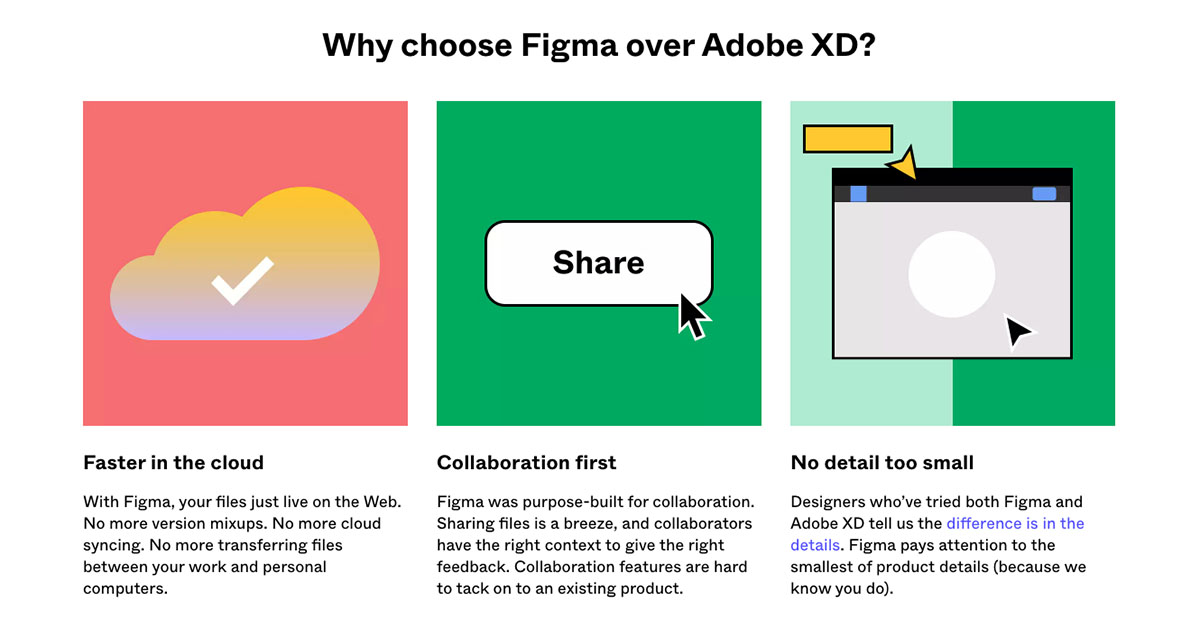
For instance, Figma provides an example of how it starts with a primary argument and elaborates on this for most of the page, only breaking out into broader benefits once this has been established.
3. Aim to come across as authentic and unbiased.
The content in your comparison landing page should not feel like a full page marketing ad campaign. The page should exist to help a user make “The Better” purchase decision. Similar to showing customer reviews of a product, it is beneficial to show your flaws. If your product only has 5 star reviews, then it seems inauthentic (there’s a reason a lot of people read the 1-star reviews on Amazon first when making a buying decision). In a similar fashion, if you position your competitor as having no benefits, then you are probably being disingenuous.
This IMPACT vs New Breed vs SmartBug article is another example of a good neutral headline that matches search intent. It goes on to acknowledge the quality of the competitor but then positions itself as the better choice for the target audience.
5. Keep it simple.
Keep to your main arguments, illustrate them, and drive the user further down your funnel. Outside of highly specialized or complex products, users are not interested in product comparisons that read like technical manuals.
If possible, it is better to invite users to see the product for themselves, rather than persuade them 100% on the website. The proof is in the pudding, so to speak. This is why many SaaS products offer some form of 1 week to 1 month trial.
The most technical you should get is when providing a product comparison table. But even then, keep it to the features that your customers are interested in and are looking at to make a purchase decision. Make sure you position it to highlight any features your product has that your competitors don’t.
Finally, avoid writing a PHD thesis that is overly long or links the user off of the page. It is unlikely that most customers will read this and linking customers off of the page will result in them getting lost and more likely to abandon the funnel, as they do not know where to proceed next. Stick to your central arguments and naturally lead the user to the next step in your marketing funnel.
6. Don’t forget that your objective is to get your user to take action.
The aim of your landing page is to persuade the user to purchase your product rather than your competitor’s. Ensure you have a clear and consistent next step throughout the experience that allows your user to take this next step. At a minimum, the next step should be positioned at the top and bottom of the page, if not throughout, or via a sticky CTA. Ideally this next step should feel like the obvious conclusion after reading the comparison and arguments outlined on the page.
Even if you have the perfect next action for the user, there is always an inherent cost for the user to take that action – whether it be mental or monetary. You must find a way to lessen this cost by increasing the perceived value. One way to do this, especially for large complex purchases, such as SaaS products, is to offer a free trial, as this can be positioned as an easy non-committal action that allows the user to see how good your product really is. Framing the trial as a free, no-commitment consultation to assess compatibility, best options, and pricing with your product can help entice users to check it out.
If the nature of your product means the user must purchase the product as the next step in the funnel, is there a way to add a sense of urgency? Think of “time limited offer,” “special discount,” or “free bonus items.” All of these apply to a product that does not require a day-of purchase. It is ultimately about helping the user overcome any last vestiges of resistance to taking the next steps.
If you’d like to learn more about building and optimizing your competitive landing pages or identifying additional growth opportunities on your website and digital funnels, reach out to us to get started!
Learn more about our creative performance offering
Explore
More Insights?
View All Insights


Questions?