
Founded in 1967, GUBI is a Danish design house famous for its daring, elegant and timeless collection of furniture, lighting, and interior objects sold worldwide. In their own words, “GUBI brings forgotten icons of the past together with tomorrow’s classics”. The brand, a leader in the Danish design scene, approached DEPT® to help optimise the usability of the upholstery section on their website.
The starting point
When we started the project, GUBI Upholstery was an already visually stunning website with a heavy focus on explorative experience, designed by digital agency Limbo. However, the site was lacking usability, leaving the users with poor navigation options and difficult paths to find the right fabric for their furniture model.
Our goal, therefore, was to optimise the usability, enabling users to easily navigate, filter, and order samples, while at the same time keeping the visual and immersive experience of the upholstery section.
Levelling up the user experience
To reach our goal and level up the usability of the upholstery site, we took several measures:
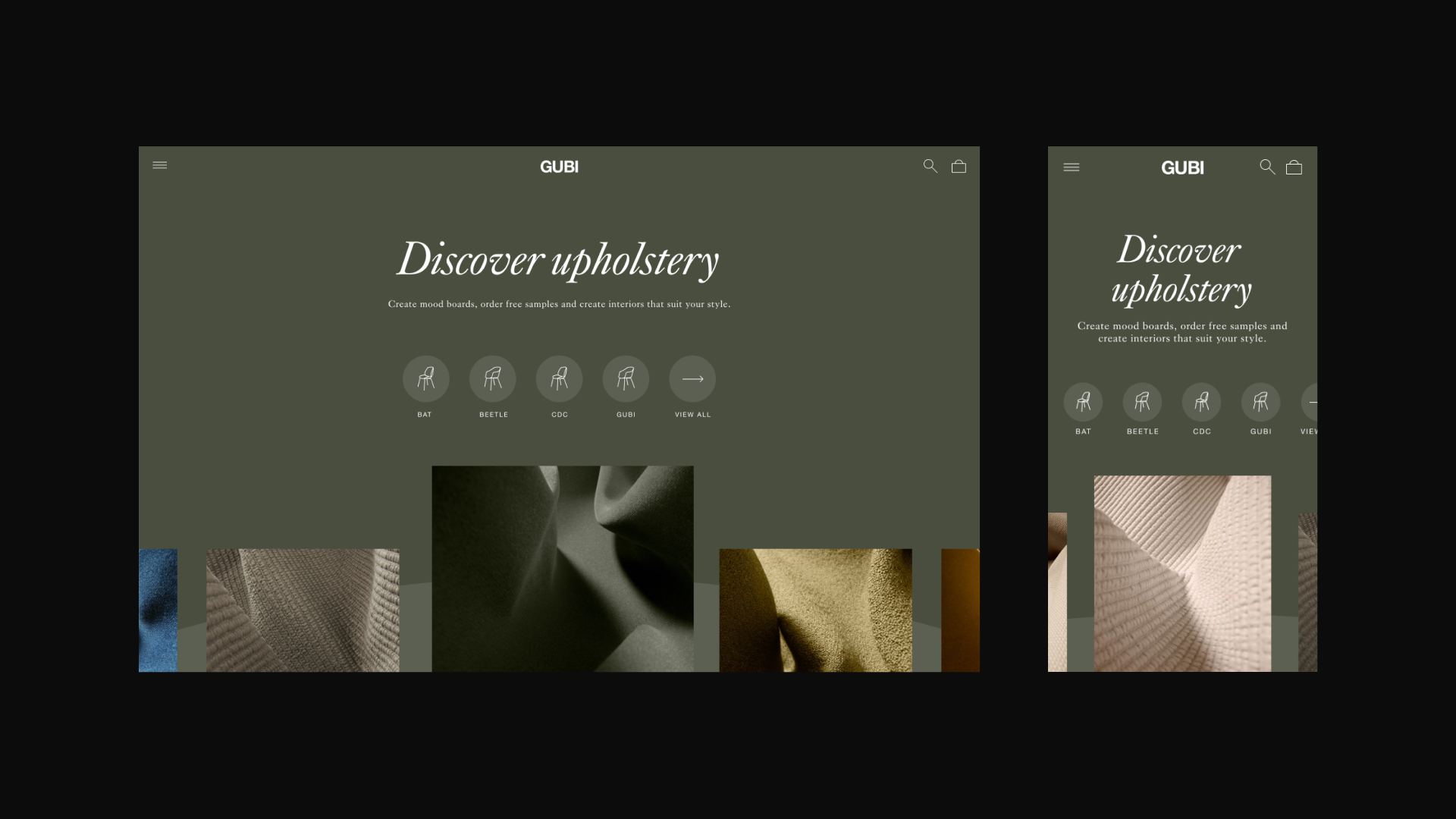
Load screen and front page
We introduced a load screen showing a small sequence of fabrics, so when a user first accesses the website, they are immediately introduced to the topic. On the front page, we made sure that the purpose of the site is communicated up front, offering different starting points to accommodate different user journeys. While we reused the existing functionalities, we added references from the actual fabric samples on the site.
Navigation
In terms of the navigation, we followed best practices, for example, by adding a magnifying glass icon for the search functionality and a bag icon to direct the users to their basket. We also made sure that the navigation was consistent with the main GUBI.com website in order to not confuse users. Additionally, to simplify the information presented, we kept the mobile layout also on the desktop.
Exploration and inspiration made easy
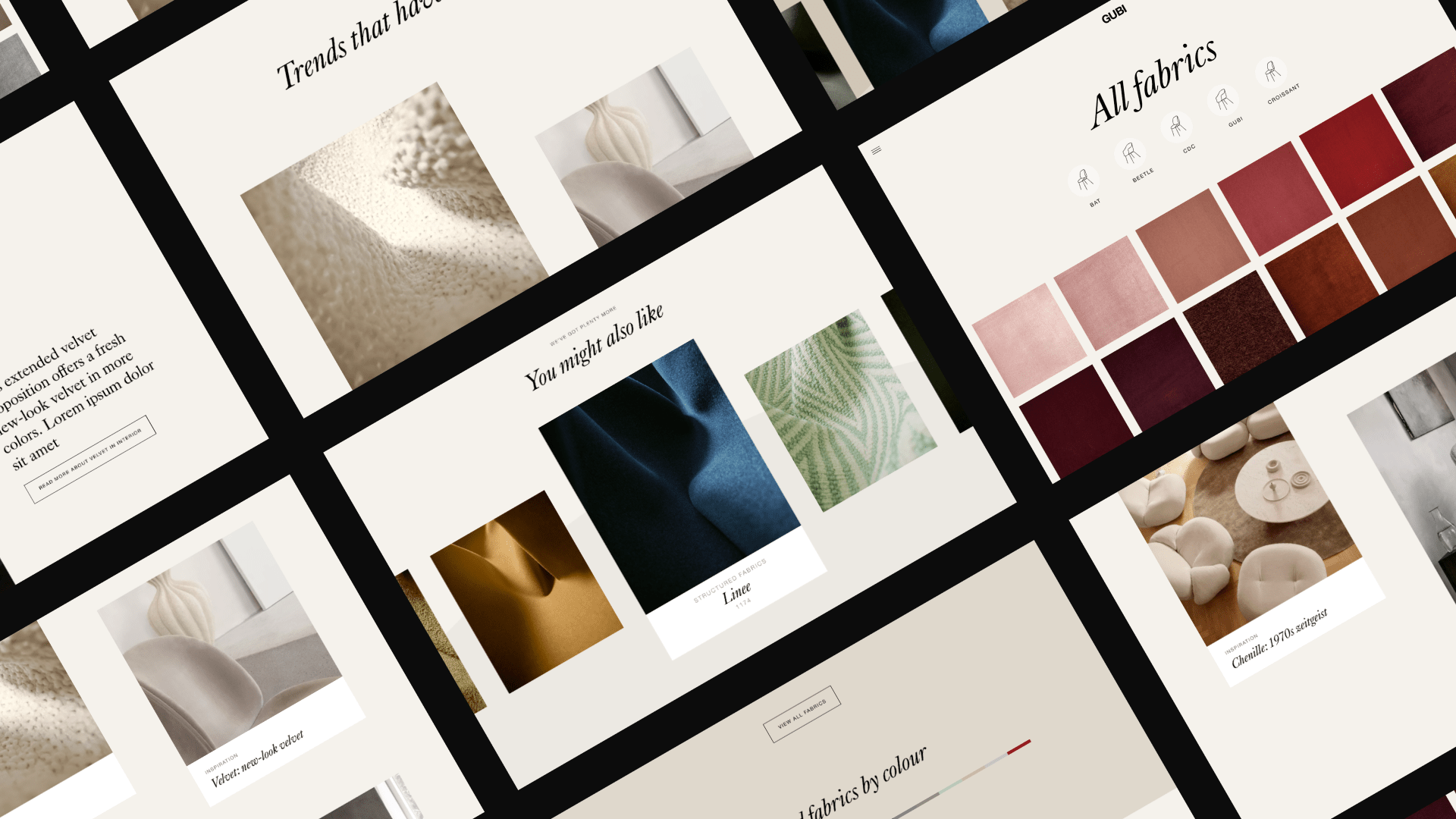
In addition to the general UX measures taken, we also wanted to improve the experience for explorative users looking for inspiration. Therefore, in the existing All fabrics overview, where all of the available colours and textures are shown independently of a specific furniture type, we implemented a feature with which users can change the size of the fabric tiles (by using the toggle on the top right) and hence the layout of the page. This allows them to explore the fabrics the way they prefer – whether that is with small tiles to see a lot of options at once, or with large tiles that are more expressive.
Through the All fabrics overview page, users can furthermore access individual list pages for each furniture fit, where the tile size adjustment feature has also been implemented.
If users desire to know more about a specific fabric, they can click on a fabric tile to access the fabric details page which provides them with increasingly detailed information on the selected fabric as they scroll down the page – starting with colour options and moving down to topics such as composition and durability. Last but not least, at the bottom of the page, users are given the option to explore related furniture models and fabrics or more inspirational content.
The result
We are proud to say that our collaboration with the GUBI team and Sublime IT, who took care of the development of the platform, has resulted in a much improved user-friendly experience that leaves no wishes unfulfilled – on either side, that is.
Together with the experts from DEPT®, we managed to take our upholstery site to a new level. Now, great usability and an aesthetic look and feel go hand in hand – a reason to be happy not only for us, but especially for our customers.
Kristian Vincent Dedenroth, Global eCommerce Manager, GUBI
Discover the website
Questions?
Strategy Director