Raleigh
A rebranding that celebrates heritage
( Services )
- Commerce
- Customer experience
- Tech & Data
At 138 years old, Raleigh (part of the Accell Group) is among the world’s oldest and best-known bike brands, a fixture of city streets before and after the automobile revolution.
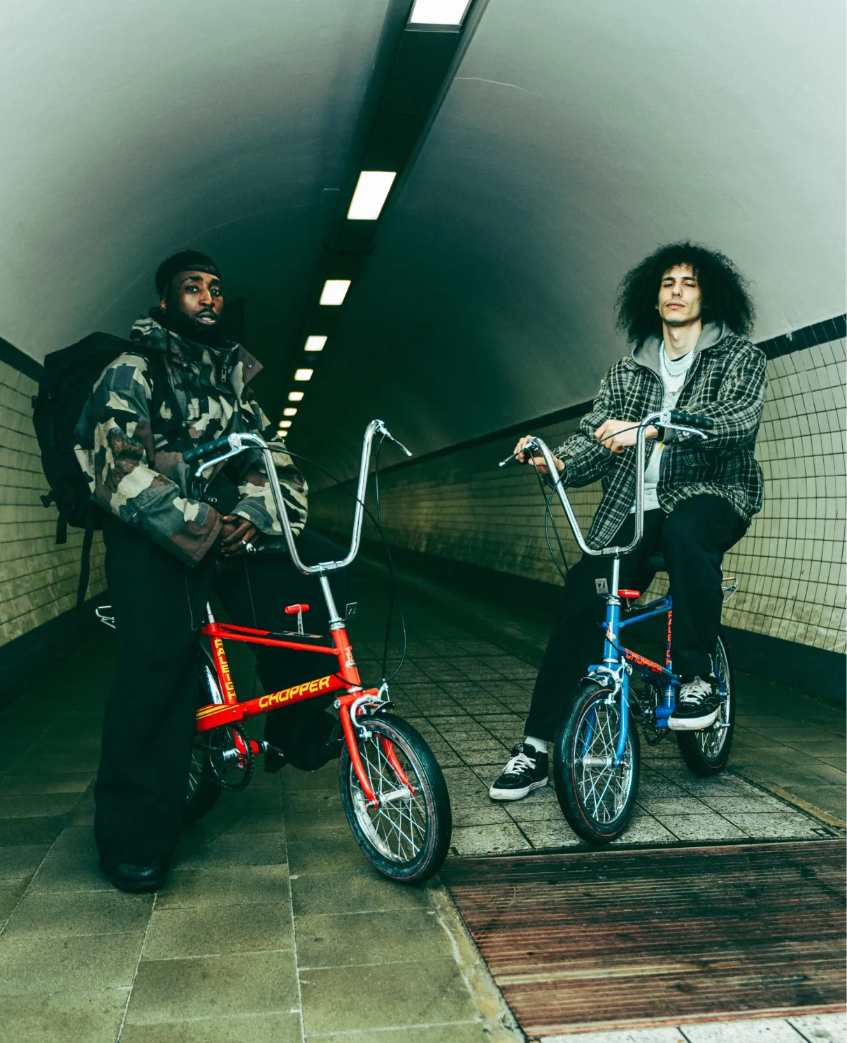
From the Burner to the iconic Chopper, Raleigh’s bicycle designs have inspired a dedicated following among millions of cyclists. Even today, riders still gather to cruise on their favorite models, a fact that undoubtedly helped the Chopper earn a place on the list of British Design Icons alongside the Mini Cooper and the London phone booth.
Nevertheless, as a heritage brand, Raleigh found itself pigeonholed by the past.
To help Raleigh embrace their legacy while positioning itself firmly in the present, we partnered together to introduce an entirely new brand system, complete with a fresh strategic positioning and a European campaign centered on the electric Raleigh ONE.
Choosing “now” over “next”
The contemporary cycling market is loud, crowded, and increasingly homogeneous. Everyone’s chasing the same aesthetic, the same language, the same vision of a pedal-driven future.
Raleigh had a choice between chasing the same trends as everyone else and rebranding itself into something completely unrecognizable, or, conversely, doubling down on its heritage and risk looking as though its eye was more on the past than the future.
However, we refused to accept the idea that Raleigh’s heritage and its present were mutually exclusive. For us, the question wasn’t about the decision to pursue one or the other, but rather about how to make that history relevant right now.
Working in close collaboration with Raleigh, we sought to uncover an identity that would move their brand forward while staying true to the DNA that had propelled them.
Uncovering Raleigh’s modern heritage
As a heritage cycling brand, Raleigh isn’t about the past or the future. It’s about the experience of moving through a city on two wheels; the feeling of living authentically in the present.
In this way, we realised that Raleigh is a brand that chooses its own path.
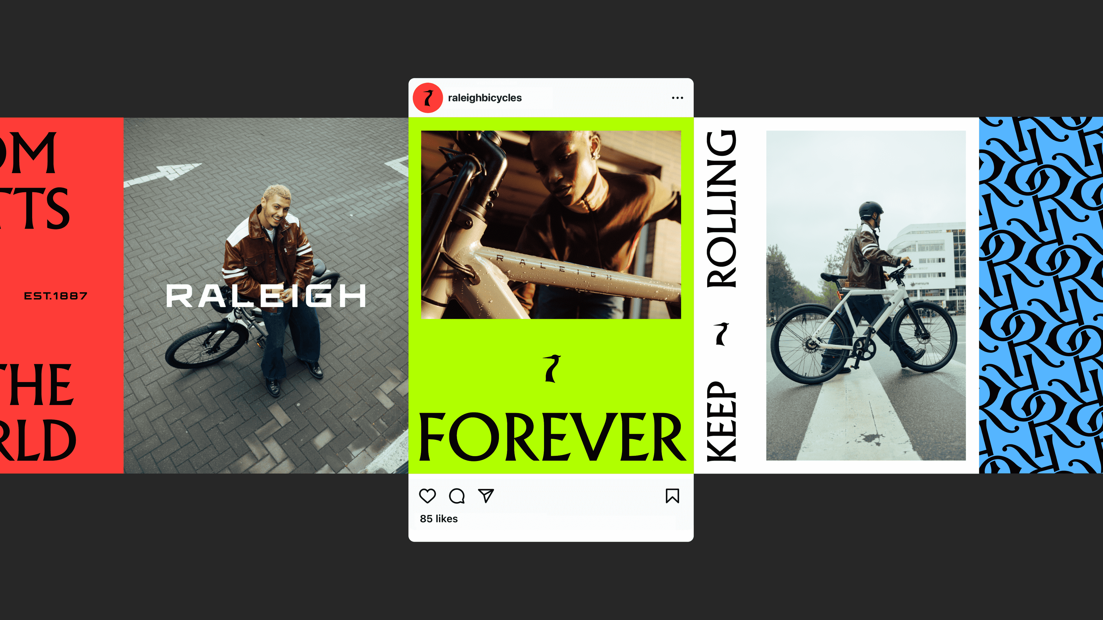
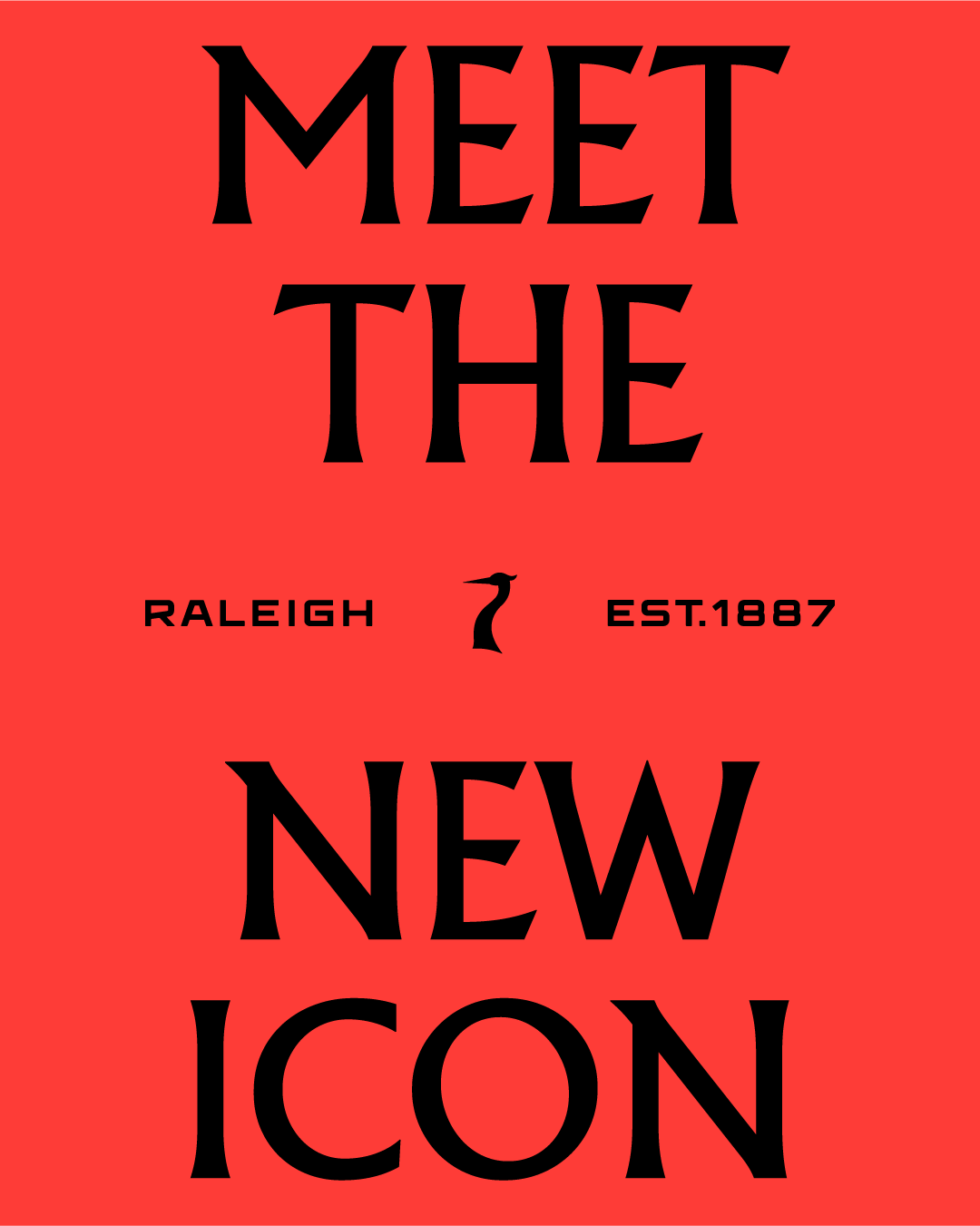
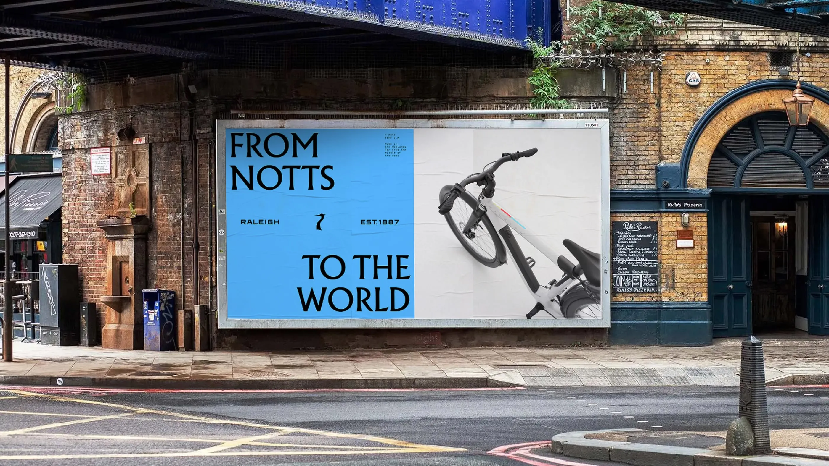
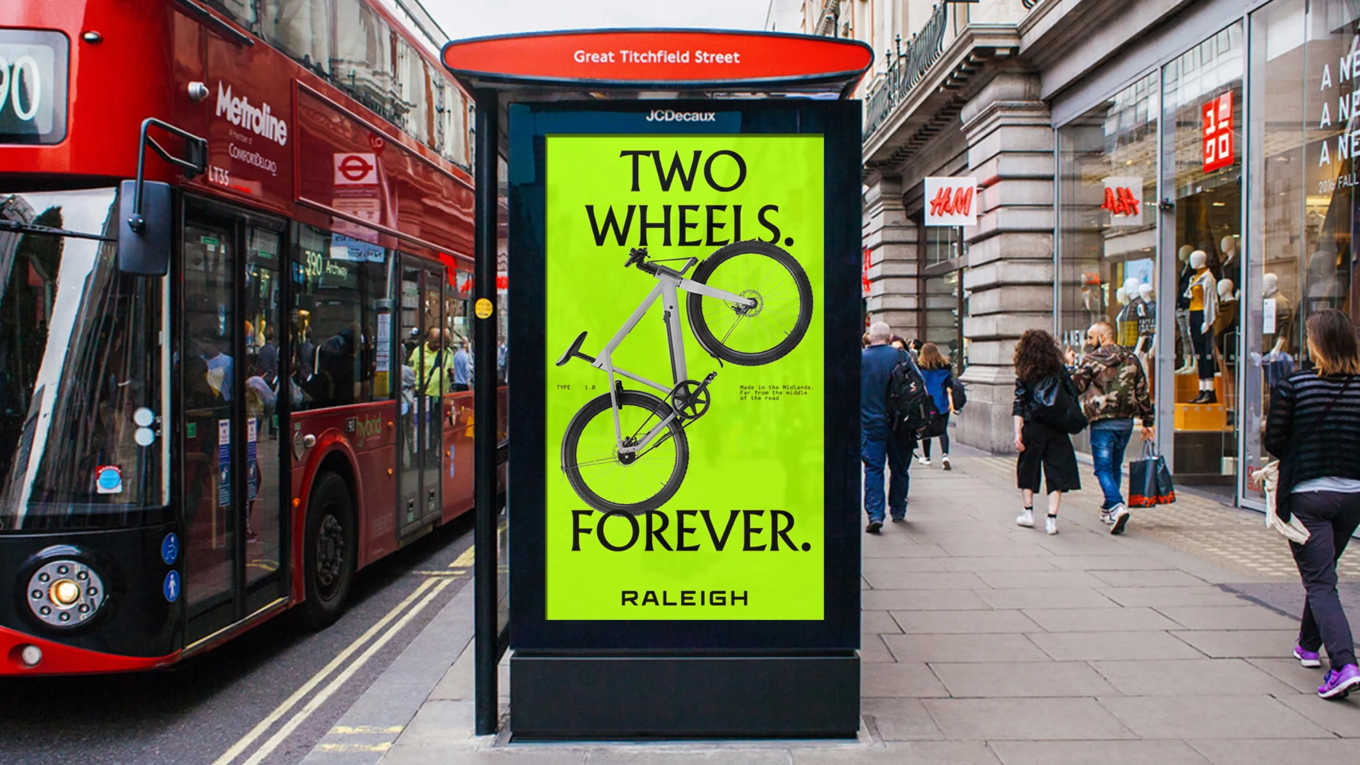
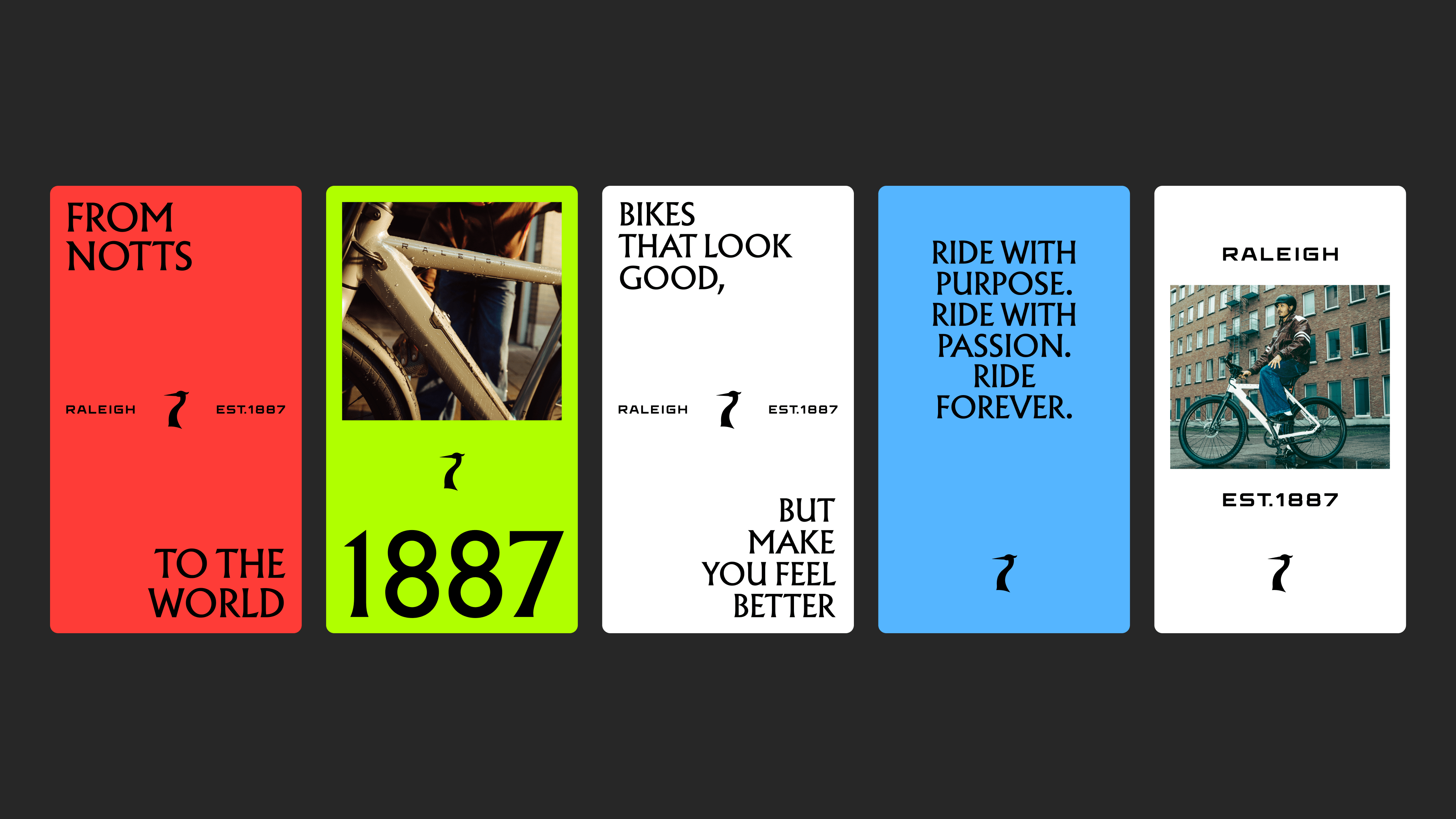
That philosophy informed every aspect of Raleigh’s transformation. The visual identity we created blends the old and the new seamlessly, with a style we called “heritage.”
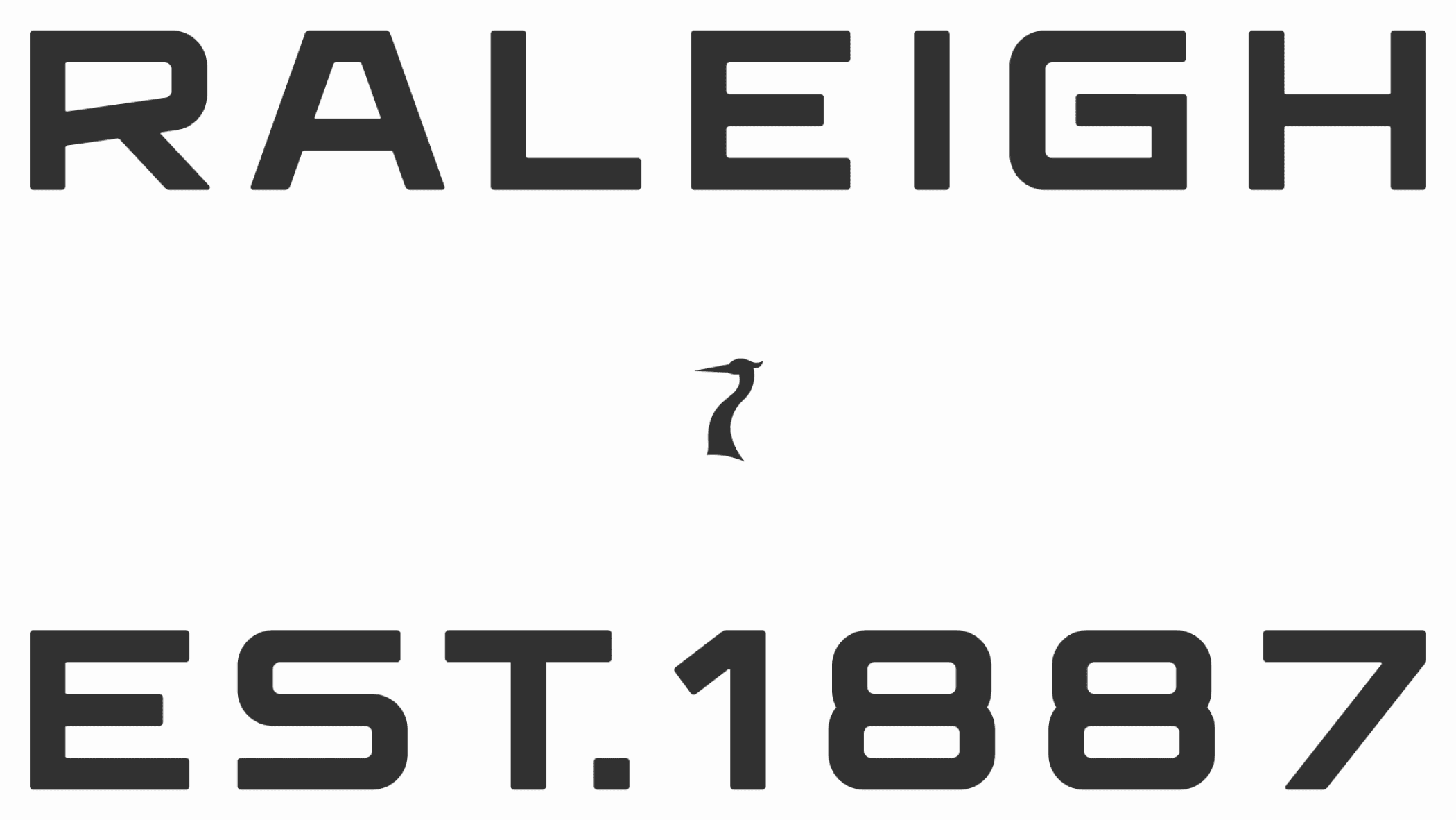
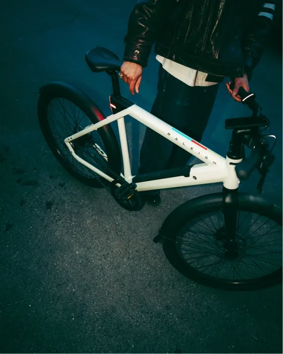
We modernised the logo, bringing the iconic heron (a detail many brands would have quietly retired) back to prominence. The colour palette nods to history but pops on screen. Typography and visual language convey personality and boldness without abandoning recognisability.
The final result feels familiar, but not dusty. It’s fresh, but it doesn’t feel like it’s trying too hard.
Bringing to life a dynamic campaign
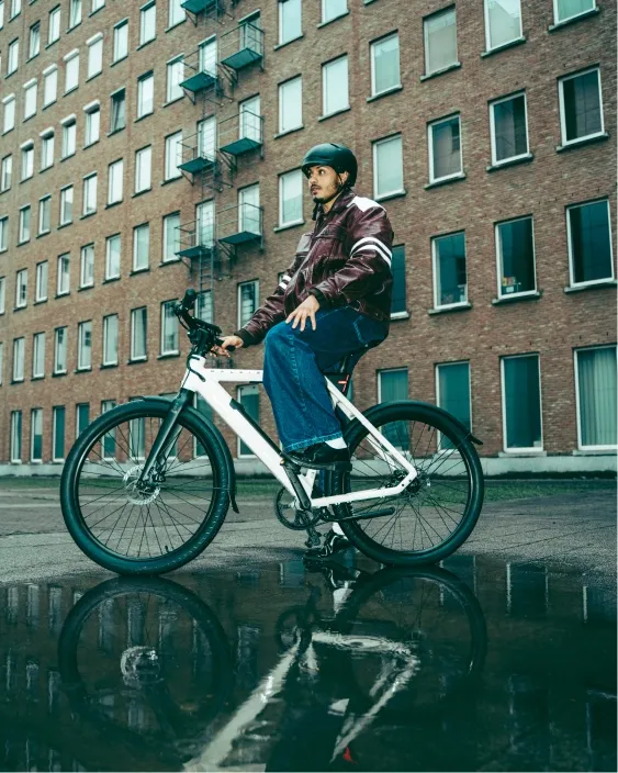
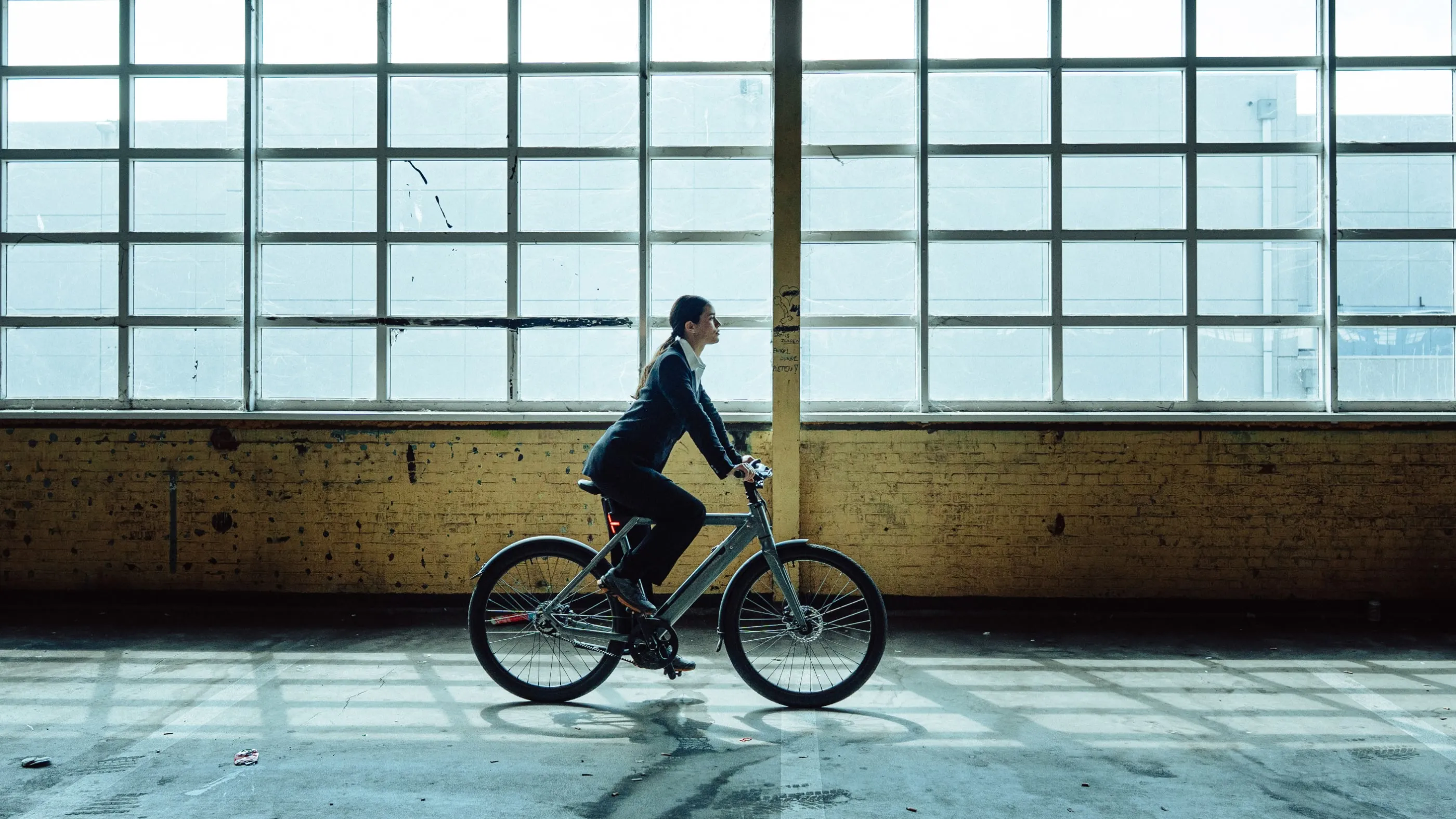
The centrepiece of the campaign that would debut Raleigh’s refreshed identity was the Raleigh ONE e-bike. This new product perfectly encapsulated a brand inspired by legacy and deeply connected to the present.
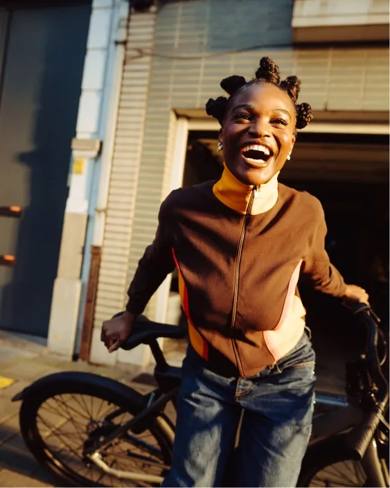
For the launch of the Raleigh ONE, we worked with a talented team of external folks that we chose based on their ability to embrace the “now” through their understanding of the current culture.
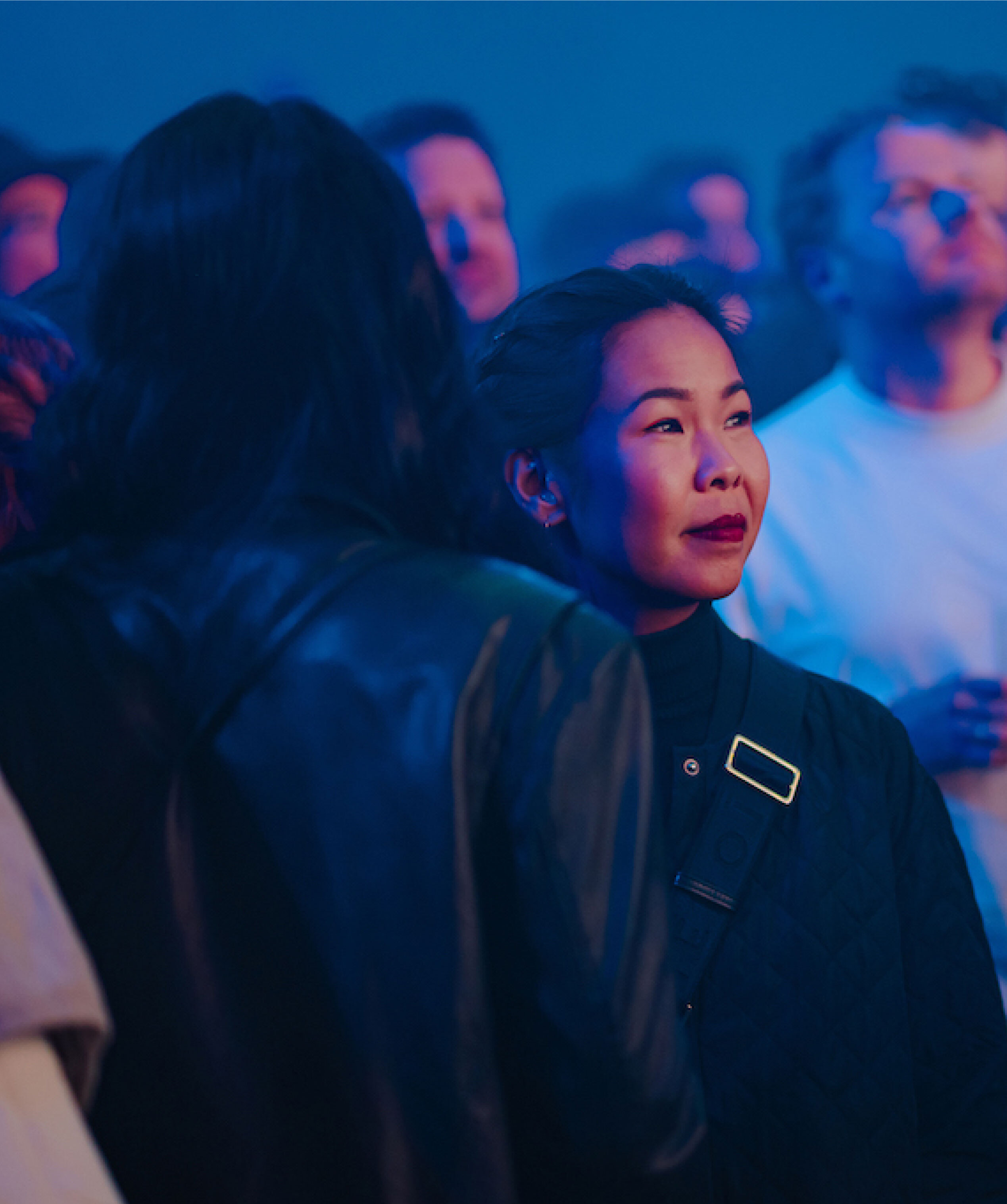
- Our photographer, Cas Kerssens, shot the campaign by drawing his unique style, which combines motion techniques, dynamic framing, and strong narratives to create work that feels both cinematic and grounded.
- Our director, Kelvin Jones, applied his raw, emotional visual style to create a film that positioned the e-bike as something more than just a solution to an imaginary problem.
The final result follows the Raleigh ONE as it moves through neighbourhoods, styles, cultures, and eras, treating the city itself as a dynamic canvas and the bike as a participant in vibrant urban life.
The road ahead
This isn’t just a logo refresh with a few style guides. It’s a complete brand system that extends the “present tense” positioning across all aspects of the brand, including how it looks, how it talks, and (of course) how it moves.
By building this identity to scale while keeping it rooted firmly in specificity, we helped Raleigh position itself powerfully and consistently across every channel.
For a brand that’s been around for 138 years, it’s a refresh that feels as distinctive as it feels honest. Not looking back. Not trying to predict the future. Just moving forward with character, confidence, and a clear sense of self.