The World Health Organization (WHO) is the United Nations (UN) agency connecting nations, partners and people to champion health and a better future for all, leading global efforts to give everyone, everywhere an equal chance to live a healthy life.
The WHO turned to DEPT® to conceptualise and design a series of awareness-raising campaign assets that would help position it as a role model on disability inclusion within the UN.
Leading the charge
The WHO Affinity-Resource Group on Embracing Disability – a voluntary, employee-led team charged with creating a diverse, inclusive and supportive workplace culture – had devised a disability inclusion action plan which they wanted to maximise the impact of. The team recognised that a strong campaign concept, visuals and messaging was needed to raise employees’ awareness of disability inclusion, the WHO’s policy on it, and how it was going to tackle it.
Being such a vast and complex organisation, with 8,000 employees in 150 locations across six regions, the WHO was looking for an expert creative partner to develop a versatile concept that would resonate across the full breadth of the organisation. As a Certified B Corporation that is committed to DE&I, DEPT® leapt at the opportunity to conceptualise a creative campaign that would empower and inspire the WHO’s global workforce to take action.
Evolving the brand
To develop campaign assets that resonate and are memorable, it was essential to establish a strong brand mark that would tie all elements of the campaign together. The WHO came to DEPT® with a starting point: a logo. Our creative experts refined and evolved the logo to ensure it was reflective of the campaign’s aims relating to accessibility and inclusion, and that it was in a format that could be easily augmented and applied across all mediums.
The logo needed to be scalable, so we redrew it before adopting typography best practice to incorporate a new, more accessible font and creating much clearer separation between the logo and the tagline; maximising flexibility by allowing for more characters when translated, with limited space restrictions. As well as providing greater versatility in usage across the campaign assets, it was future-ready for translation and application throughout the worldwide organisation.

Idea exploration
Kicking off the design thinking process, DEPT®’s creative team established a series of digital boards where they could deep dive into the brief to pull out key messages, ambitions and language that would be central to the campaign.
The purpose of this discovery stage of design thinking is to stretch as wide as possible to share all research and ideas across the team to aid optimum collaboration and conceptualisation. After interrogating the brief, we recognised the importance of the campaign’s messaging, so we primarily focused on the words that could shape the campaign. After gathering hundreds of words and phrases relating to the theme, we analysed them to develop three narrative ideas to share with the WHO.
Once we had cemented the most impactful narrative options, we started to think about how they could be visually interpreted to enhance and bring focus to the messaging. At this stage, following a thorough review of existing disability campaigns, DEPT® set an internal goal to ensure that our concepts did not go down the stereotypical route, which focused on iconography and graphics. To drive maximum impact and resonate with the vast audience, we opted for a visual direction that leaned heavily on the use of striking, abstract shapes and patterns, complemented by photography of ‘real people’ so that employees could see themselves represented within the campaign. In a bid to reflect the campaign’s aims, at all times we wanted the visual direction to be bold, confident, positive and uplifting.
Creative interpretation
Following thorough research and exploration of different routes to take, DEPT® developed three campaign concepts that could be used independently or in conjunction with one another. Every route presented challenged the disability inclusion status quo both linguistically and visually. Two of these concepts were combined to form the final campaign concept.
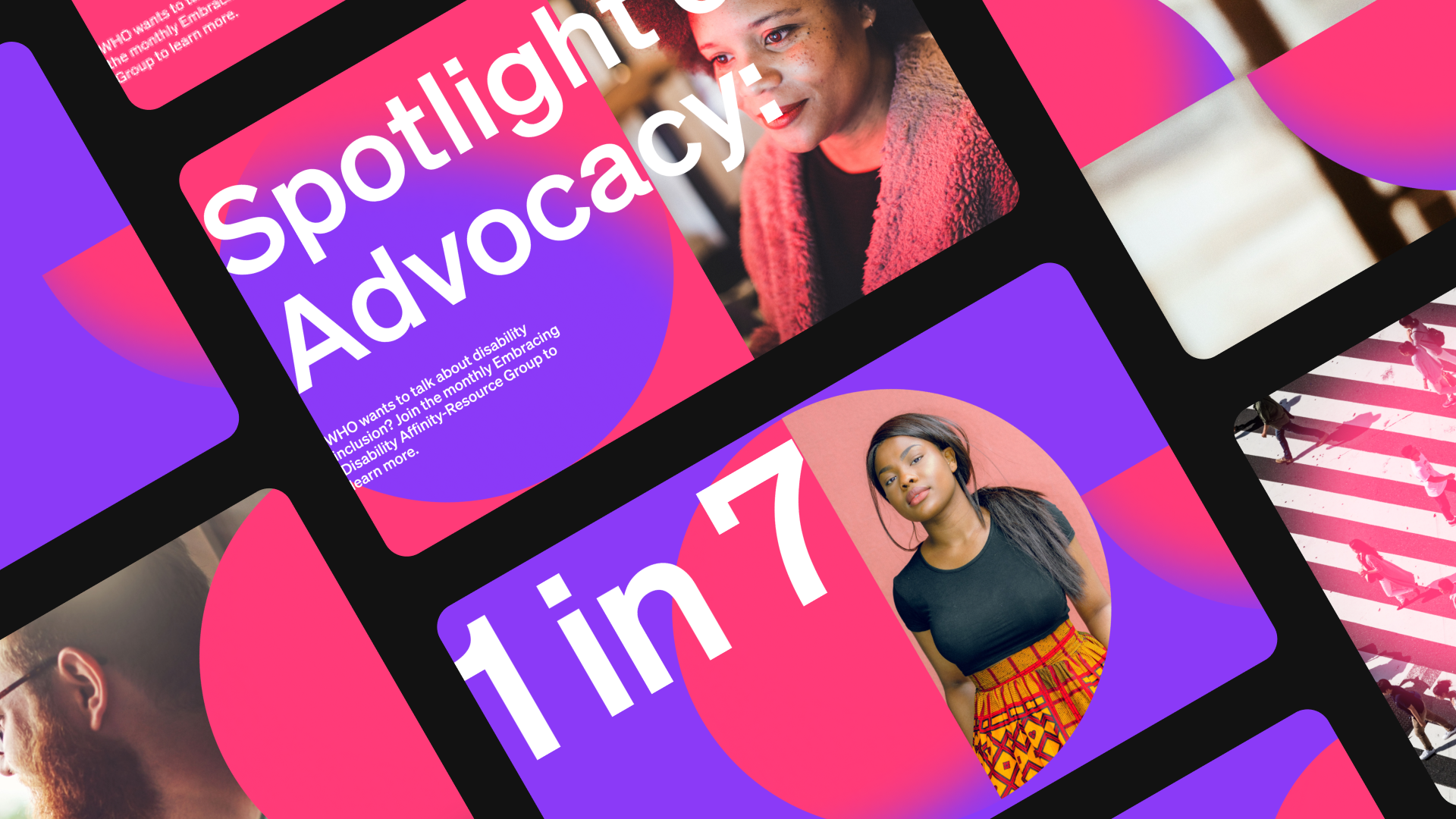
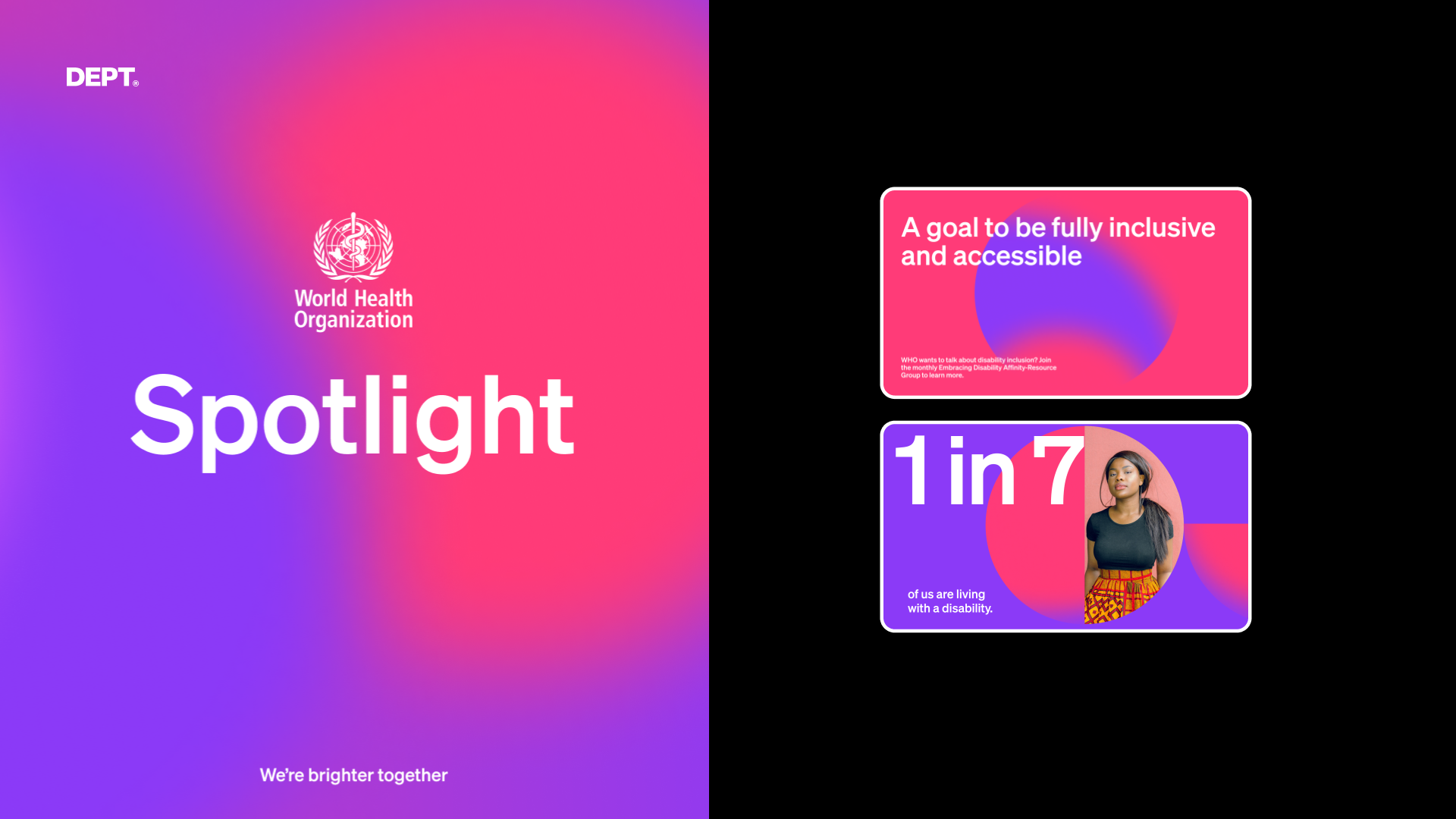
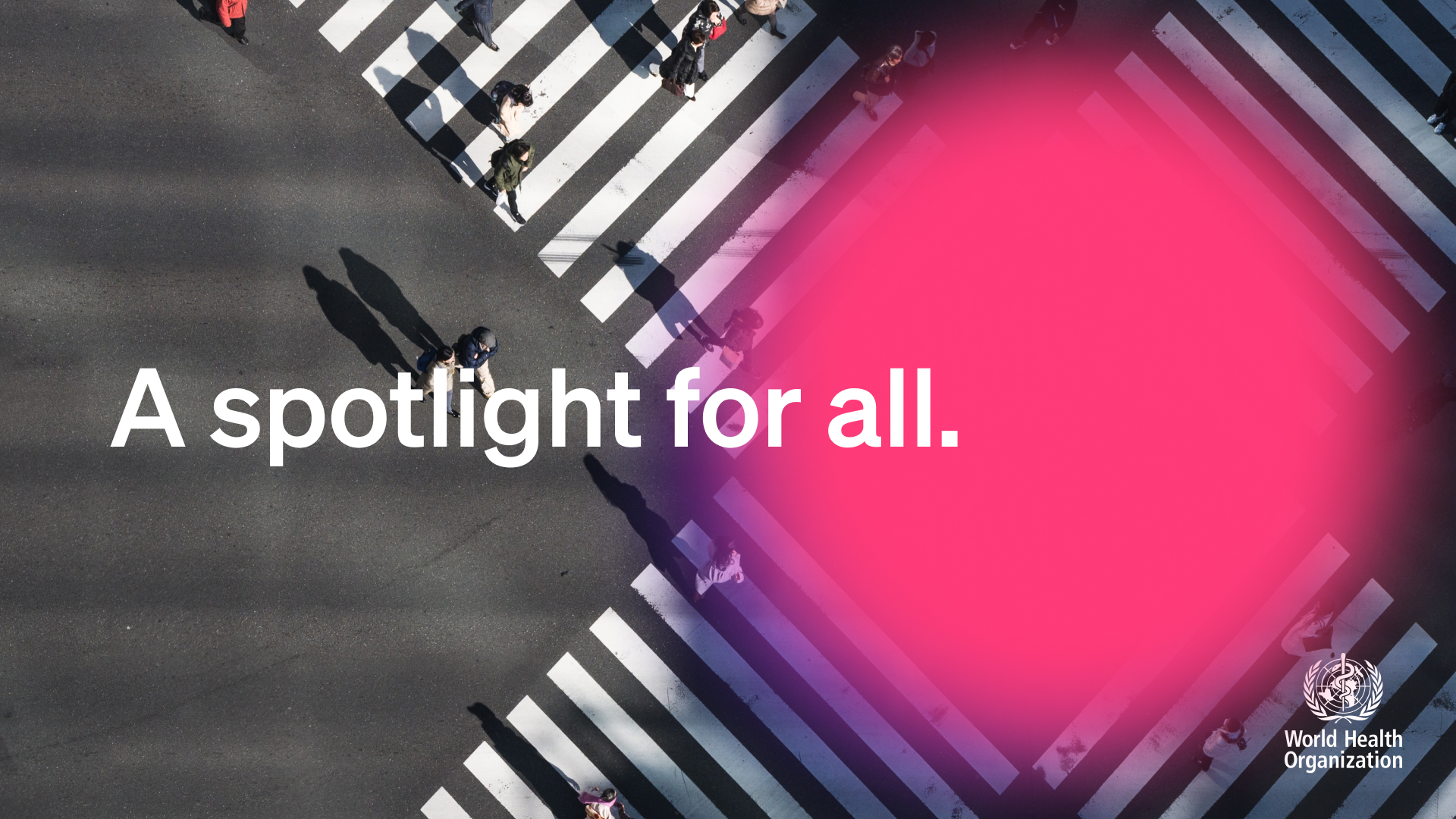
01 A spotlight for all
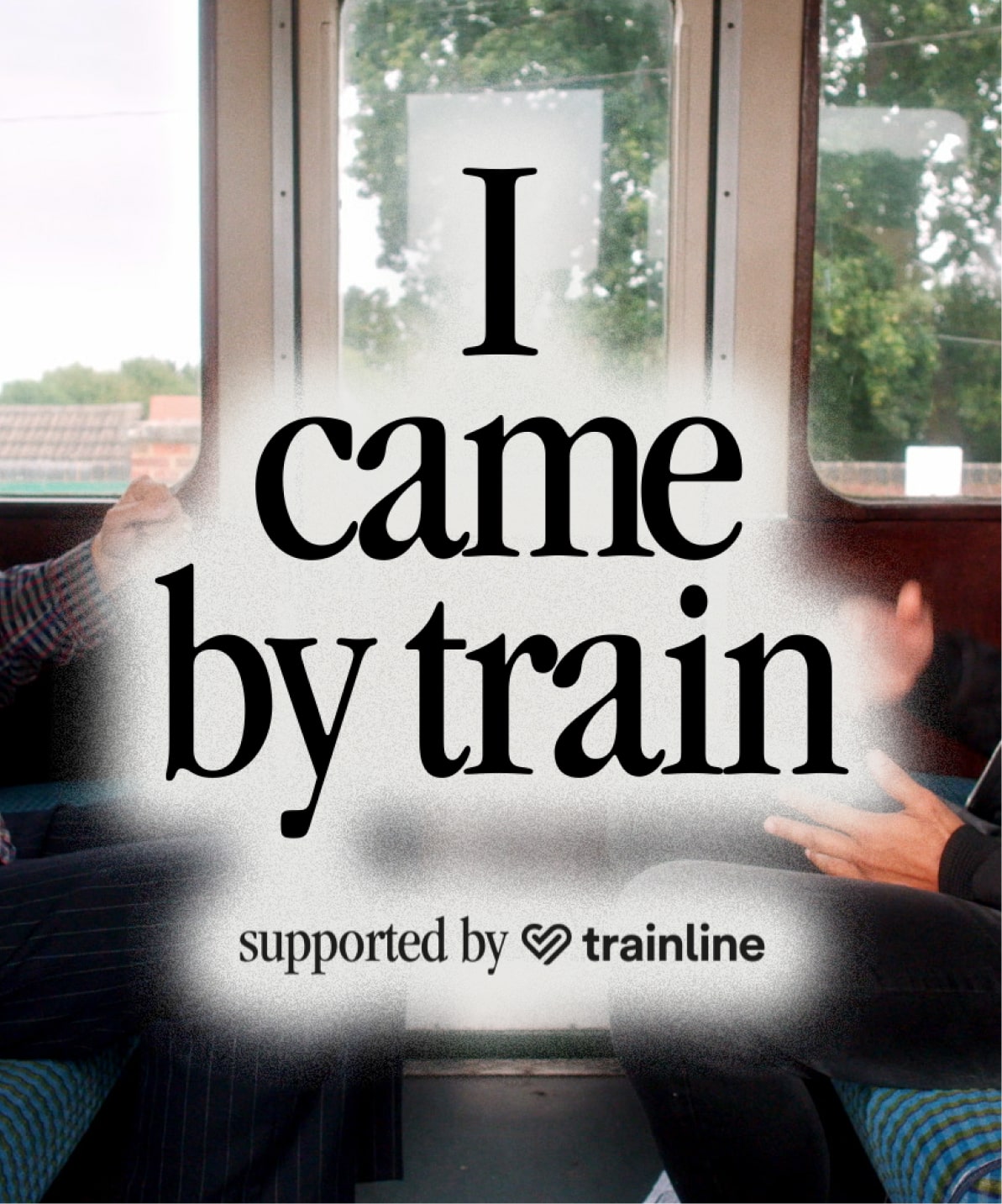
Our primary ‘spotlight’ creative concept was based on how disabilities are sometimes overlooked. We wanted to challenge the “out of sight, out of mind” mentality that is so prevalent in the space, drawing attention to disability inclusion in order to make a change. The idea naturally inspired ideas around circular ‘glow’ shapes and gradients that could be used to bring typography in and out of focus, much like a spotlight.
Using the spotlight in this way helped us communicate that after being seen, disabled people deserve to be heard. We avoided the use of stereotypical imagery and, instead, opted for a more abstract and versatile choice, with different sized and positioned ‘glows’ reflecting the diversity of disability, as well as providing the opportunity to highlight individual disability challenges. The approach also provided the flexibility to work both as a purely graphic asset, or complemented by photography.
02 1 in 7
15% of the world population has a disability. 15% of the WHO’s workforce equates to 1 in 7 people. This was cemented as the secondary message of the campaign for its ‘wake up and pay attention’ impact, highlighting to team members that they will cross paths with people with disabilities more frequently than they may have realised.
We took colour inspiration from the existing logo, adopting magenta as the primary hue for its eye-catching qualities, and incorporating this with a purple shade that has increasingly become associated with disability awareness and has been used in a previous WHO campaign, allowing for recognition as well as an element of continuation.
As an absolute minimum, we ensured all design elements, including font and colour choices, met the requirements of Level AA WCAG (Web Content Accessibility Guidelines). Although true Level AAA requirements are largely based on black and white designs, we incorporated as many of the technical elements as possible, while nodding to this through the use of imagery that was largely black and white in tone, creating a striking contrast against the vibrancy of our chosen colourway.
Maximising versatility
All too often, campaigns only translate well in certain situations and mediums. So flexibility was paramount to the effectiveness of the concept. Not only did the assets have to resonate digitally as well as above the line, they were to be translated into multiple languages to be communicated across the six world regions the WHO operates in, and meet both immediate and longer term campaign requirements.
The campaign assets DEPT® produced were in English, but with the WHO rolling out this campaign globally, we had to consider how they could be edited by internal team members for translation and circulation within their region. With that in mind, we exclusively featured text outside of any shapes to allow more freedom when translated into languages that tend to use more characters.
Although the initial brief only outlined a small requirement of flyers, GIFs and social media frames, the versatility of DEPT®’s approach enabled the team to expand on this to deliver a toolkit of campaign assets that met both immediate and long term needs for digital and print circulation. This would ensure maximum impact of the campaign across all of the WHO’s internal communication channels.
Reaching milestones
DEPT® developed a memorable and empowering campaign concept and a toolkit of assets that tick every box. In presenting this concept, the WHO Affinity-Resource Group on Embracing Disability beat off stiff internal competition to secure board funding that will facilitate its delivery across the six world regions it operates in.
The campaign will soon be expanded and rolled out across two key regions, before being communicated across the rest of the world, to drive awareness, increase Affinity Group members, and engage the entire workforce in the important discussions around disability inclusion.
Questions?
VP of Growth, Experience and Engineering
Lizzie Powell
Discover more