Launched in 2008, Google Play is the official app store for Android users. Today it has over 3.55 million apps available for download across games, productivity, and entertainment.
As the platform has grown, the Google Play team wanted to invest in a brand refresh that would elevate the store’s content. Hello Monday/DEPT® was engaged to create a brand that would visually express Play’s mission to bring joyful and useful experiences to Play users while delivering value to developers.
Creating a flexible design system
Working closely with the creative team at Google Play, Hello Monday/DEPT® created a design system that adapts to the evolving needs of Play’s users and content partners. At the same time, we aimed to stay close to a parent brand recognised and loved by millions of people around the world.
Honouring Google’s brand heritage
For many users, the Google brand is synonymous with an accessible, trusted, and useful vision of the internet. It’s a brand they interact with everyday and recognise instantly.
Given how essential branding has been to Google’s success, Hello Monday/DEPT® wanted to create a distinctive brand identity for Google Play that would feel like a fresh take on classic Google. You know it when you see it.
The logo that started it all
Our team was first tasked with bringing Google Play’s logo closer to the parent brand, driving cohesion across Google’s core products and services.
At the same time, Google has invested in becoming a design centric company, launching Material Design 3 in 2022. Also known as Material You, this forward thinking design system gives control to users, allowing them to meaningfully customise their devices’ UI to suit their unique needs and personalities. Drawing inspiration from this approach, we set about creating a visual identity for Google Play that could also adapt – developing a truly diverse and flexible visual language.
With soft, rounded corners, the new Google Play logo reflects Material You’s visual language while using the core colour palette to celebrate the brand’s heritage. The 90 degree angle at the centre of the logo would later become the foundation of our new design system.
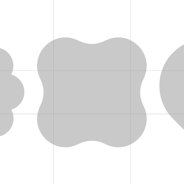
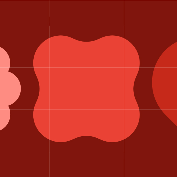
The creative process behind a simple 3×3 grid
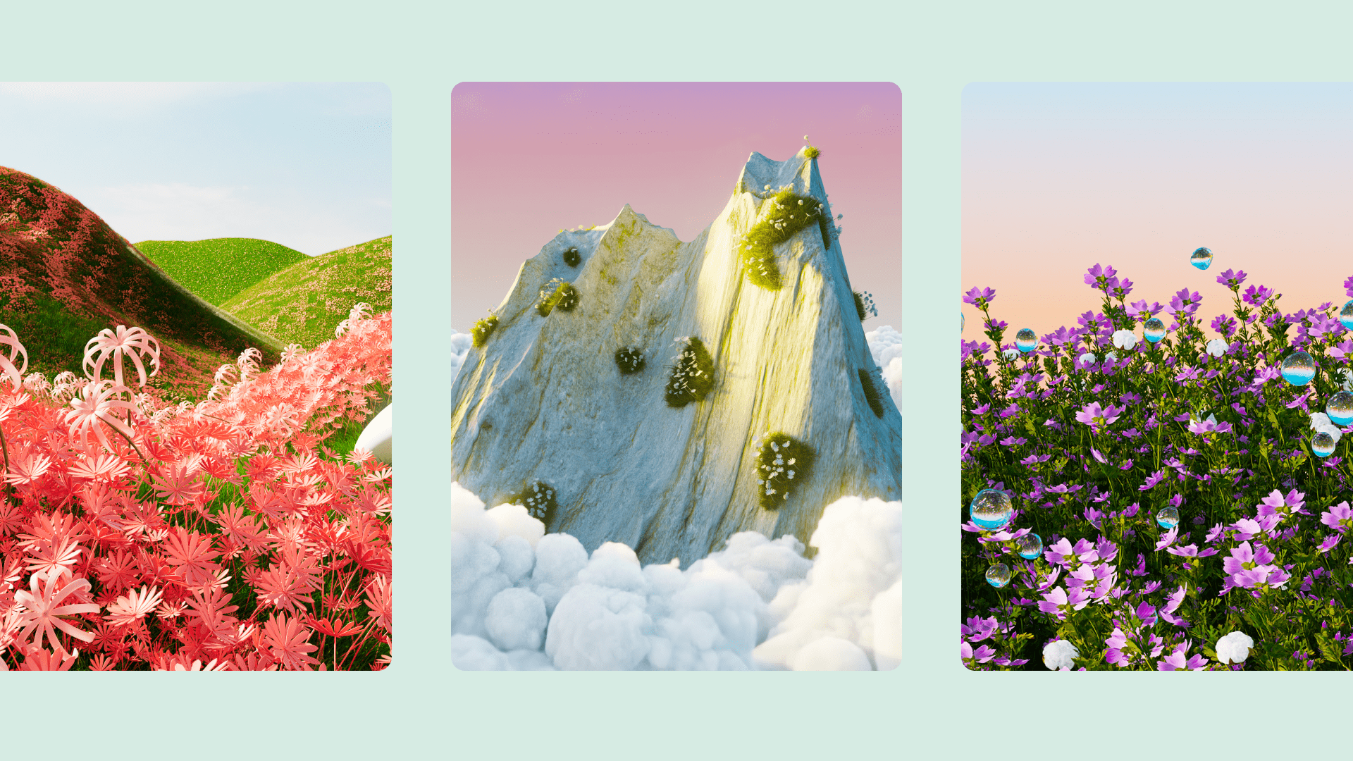
We knew we needed to find solutions for packaging the incredibly varied assets provided by Play’s developer partners, while also establishing Play’s unique point of view and voice as a brand. It was a complex problem that had a simple solution. Our design team began experimenting with positioning a library of simple shapes within an even more simple 3×3 grid. The shapes would act as containers for partner artwork and assets. A new design system was born.
The combination of functionality and flexibility provided by the grid system enabled our team to build an extensive library of design templates supported by a broad colour palette, a collection of textures, gradients, and more. Our goal was to make it easy for Play’s design team to adapt the identity to compliment a vast spectrum of content, connecting users to the right thing, in the right place, at just the right time.
Step 1
Step 2
Step 3
Questions?
Designer and Partner, HELLO MONDAY/DEPT®