

Designing a simple, 5-page website? Easy. Every page gets a custom design.
Designing something bigger? That’s a different story.
The problem with designing at scale is two-fold. On one hand, you can’t customise every single page. And on the other, relying too heavily on modules and templates makes everything look the same.
Finding a happy medium allows your website or e-commerce store to look consistent while also maintaining creativity and flexibility for different intentions page by page. To find this happy medium, we believe most teams should leverage modular web design, but with purpose and rules around its usage.
What is modular web design?
Modular web design uses a module-based design system to structure web pages. Think of a module as a section of a page that is made up of smaller elements.
For instance, you might have a module called “Newsletter Sign Up Block” which consists of a soft gradient fading background, a video on the left with a heading, a section for body copy, an input for email, and a signup button.
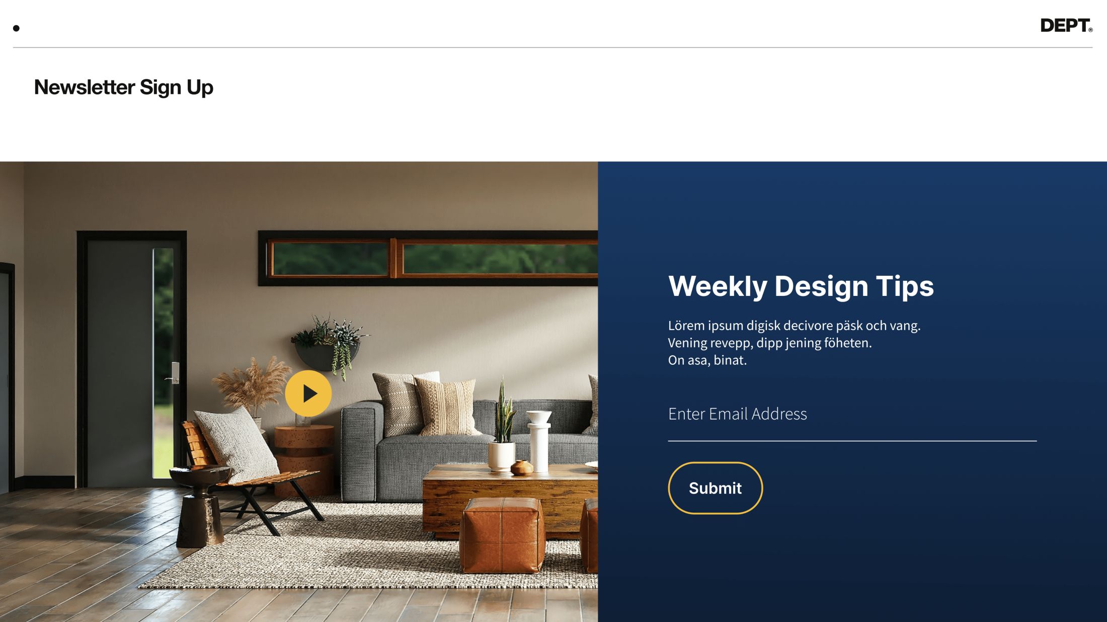
This module is made up of branded components that are reused across the site. The same heading style, button style, input field, and background gradient are used elsewhere in the system.
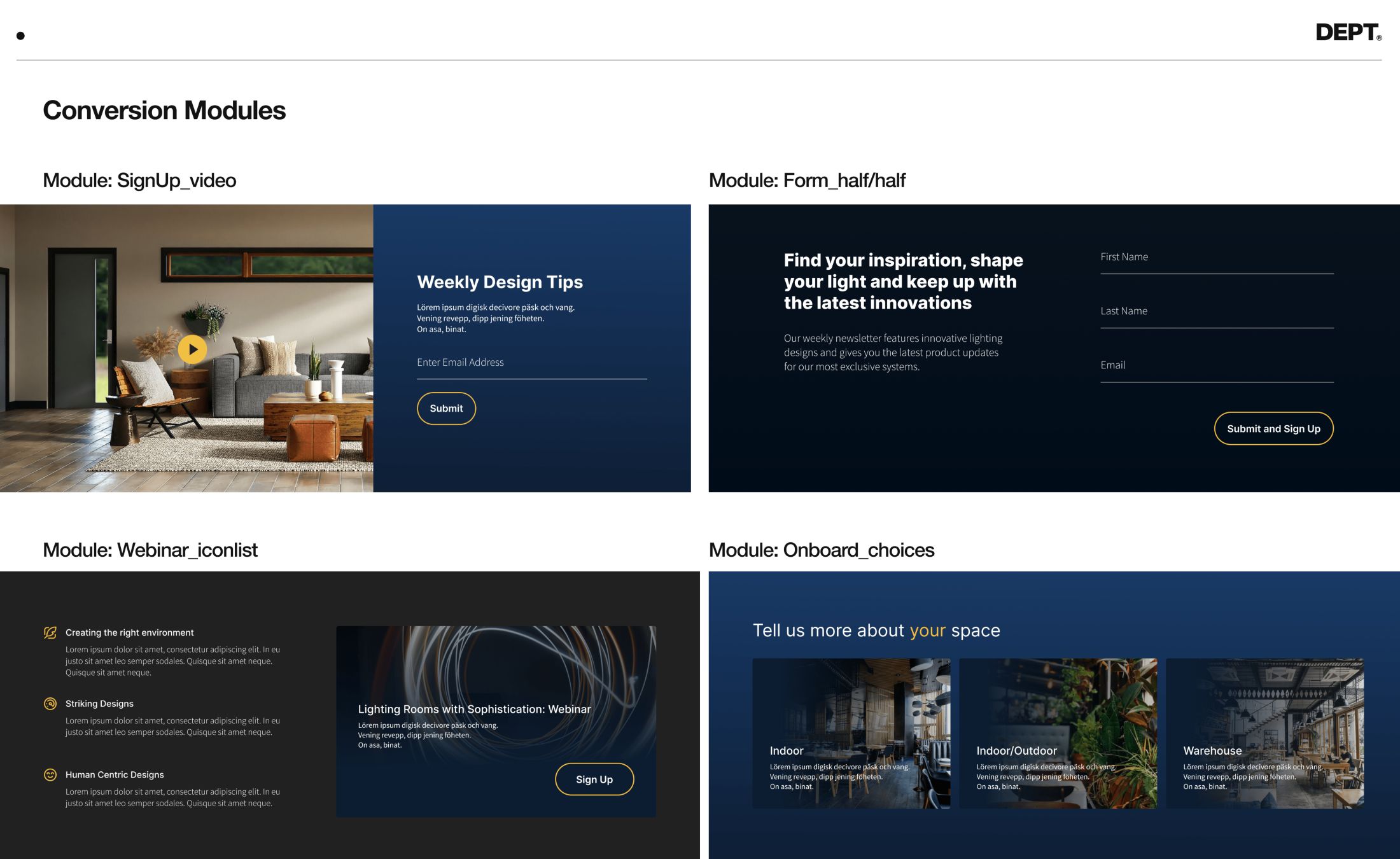
The real power of the modular system comes from its variable nature. In this instance, we talk about these items being used in combination to create the “Newsletter Sign Up Block.”
Recall this “Zonal Definitions” exercise. A more robust and flexible way to think about your module system is to assign modules to zones of purpose. The “newsletter sign-up block” falls into the zone of “Conversion.” If we think about it that way, we can start to see how the “newsletter sign-up block” is just one of many modules that fall under the category of “Conversion.” The modules in these categories can utilise variants that are slightly different design executions utilising common UI elements for a similar purpose.
Building your modular design system from this philosophy will help you design for greater flexibility and scalability.
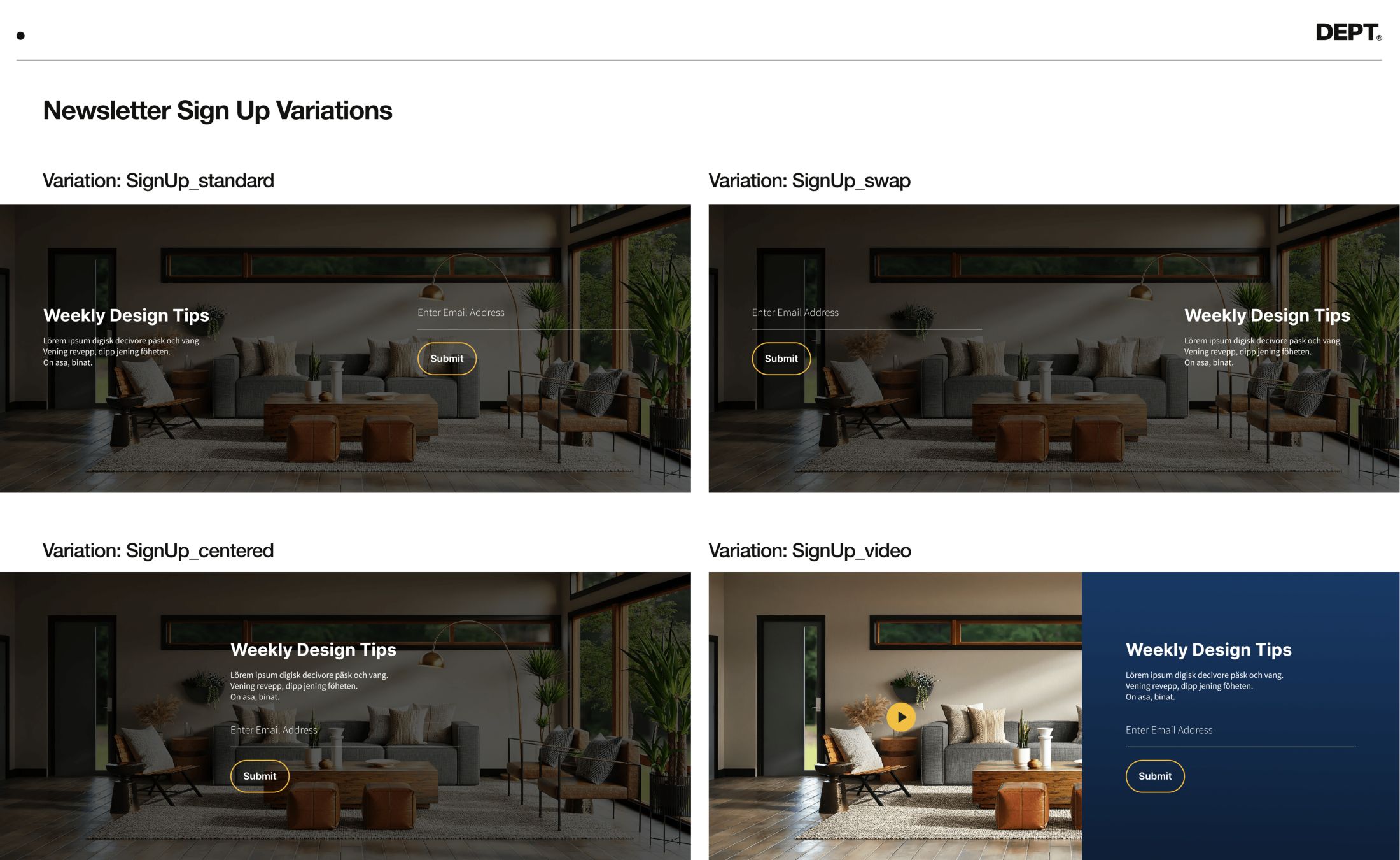
What this allows you to do is create flexible modules, built from familiar design elements branded to your system.
The end result is a module library with a plethora of variations that feels flexible yet consistent and repeatable.
This not only makes development significantly easier– it drives consistent, carefully crafted UI.
The common problems with modular-based design systems
Module web design sounds great, right? But there are some challenges with modular design.
In many cases, it becomes obvious where one component begins and another ends, which results in a blocky “WordPress” builder look. In other cases, not enough variables are created and everything ends up looking the same. Both of these problems lead us to the question:
How much variation should I have to create a seamless experience?
This is the question we’re going to attempt to answer with our tips below.
How to start creating with modular design
FYI: Before you start designing, you need to have a content strategy, information architecture, and zonal definitions in place. Learn about these essential pre-design system processes here.
We can probably all agree that 12 different buttons or 100 module blocks are excessive, but there isn’t a magic number of how many modules or variations are needed to build a well-rounded system.
It comes down to the number of pages needed, the project, and brand personality, among other things.
Our advice here is: Don’t design something until you know you need it.
Yes, you will need heroes, but don’t pre-generate a variety before you have the full context of each page.
As much as you want to think of individual components, you have to design with the page in mind. While you should be thinking about modules and zones from a philosophical perspective, it’s okay to give into the design process and focus on the page you are working with.
Questions to ask yourself and your design team:
- What is the natural flow of my core pages?
- How can I take these modules and create other pages?
- What should come before and after each module?
Design for the screen
How much of the screen or viewport can you see at a time? Ideally, your users are looking at one module at a time.
Modular-based systems should speed up your process
Not hinder your creativity.
This philosophy is simply a tool to use to scale your design process. It should not restrict pages from being customised if that is what is needed for your website.
That being said, this is only true if you follow the process of
- Design core pages
- Select modules from those pages to carry over
- Design and templatise new pages
If you skip the first or second step, you can’t complete the third.
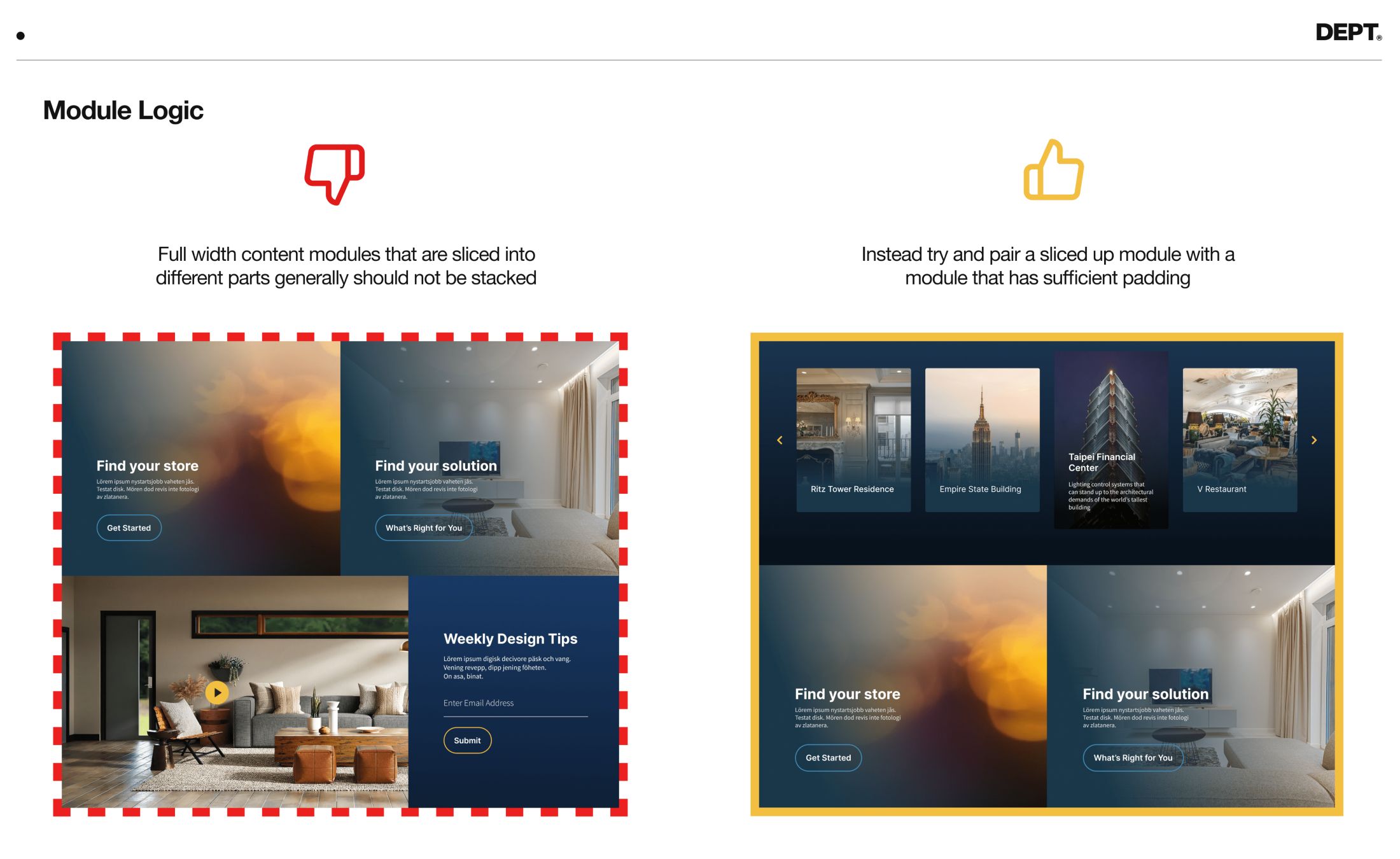
Rules for combining modules
Sometimes, specific modules don’t complement one another. While the core design team knows this (and would never create a layout using certain combinations), your website or marketing team may not consider this when they launch new pages.
This is where guidelines are critical. By creating rules around the proximity of components (component A can only be used before B and C), you can mitigate this issue.
Generally speaking, the larger and more varied your website is, the larger your design system.
You’ll also need more rules and guidelines to make modular web design operate successfully.
Need help designing a custom website or e-commerce store? We’d love to work with your brand to create a customer-led, experience-driven website.