


Welcome to design systems 101, a five-step guide that anyone can use to begin to understand and implement design systems.
Let’s start with the basics.
Define your team
The first lesson in any design system 101 class is to think about who needs to be involved to bring the concept to life. The people who use the design system will be the foundation of its success.
As it may be a completely new way of working for your business, it’s imperative to have all key stakeholders involved from the get-go. This will ensure everyone moves forward in the same direction and enable them to collaborate optimally in both the short and long term as the design system is implemented and evolves.
Despite the name, we can assure you that it takes more than a team of designers to develop a successful design system. Design systems bridge the gap between visual designers, UX/ UI specialists, and front-end developers, so each of these teams will need to be involved… but that’s not it.
An ideal team would include
- Designers to define the visual elements
- Front-end developers to create modular code
- Accessibility experts to ensure the system conforms to WCAG 2.1 standards
- Performance and optimisation experts to ensure the system loads quickly on all devices
- Product managers to ensure the system is aligning to customer needs
- Leadership team to champion and align the vision throughout the company
- Content strategists to advise on the tone of voice
- UX researchers to help you to understand customer needs
Depending on the digital maturity and in-house resources of different companies, it is at this stage that some will decide to work with an external agency that has expertise in delivering these types of solutions.
Some organisations simply do not have the right people or skills to deliver a future-forward solution, while others do but appreciate the impartiality that comes with an external partner that can provide fresh perspectives and really elevate the project to ensure its success.

Conduct a visual audit
Before building a design system, it is fundamental to complete an audit of your current design, be that an individual digital product or your entire digital estate.
To understand how small or large the task will be, it is important to take stock of all visual elements such as colour, spacing, and typography, as well as UI elements like buttons, cards, lists, and forms, in order to see how much design debt needs to be addressed.
This can be done as simply as screenshotting different elements of digital assets and storing them in a categorised document where you can review all the elements. However, it’s not a small task, so we suggest getting as many team members as possible involved.
It is at this stage that many companies realise how inconsistent their brand identity has become without a modern solution in place; with numerous different hues of brand colours, font families and sizes, or variations of the same type of button.
But by gaining a complete and holistic view of these design and UI inconsistencies, the more effectively you will be able to merge or remove different elements to create a more streamlined and robust system.
Create a visual language
The visual language is the backbone of a design system, this comprises the ‘basics’, ‘elements’, and ‘principles’ mentioned earlier. When looking at basics, there are four key areas that play a role in every component on the screen: colour; typography; sizing and spacing; imagery.
Colour
Design systems most often have one to three primary colours that represent the brand. Most companies introduce a range of secondary tints to complement each primary colour, sometimes with light and dark variants of each, to give designers more options and flexibility. It may be that certain colours are reserved for certain uses, such as calls to action, to maintain consistency in colour use.
Typography
Choosing the right typeface is one of the most important steps in creating a design system. Most design systems include a maximum of two fonts to avoid overloading and confusing users – one for headings and body copy – and a monospace font for code. Keeping the number of fonts low is not only the best practice from a typographic design perspective, but it also prevents performance issues caused by excessive use of web fonts.
Spatial systems
Spatial systems, grids, and layouts provide rules that give your designs a consistent rhythm. The spacing and sizing system works best when it provides balance between elements. The 4-based scale is growing in popularity as the preferred option due to its use in iOS and Android standards, ICO formats, and even standard browser font size.
Imagery
It’s important to set guidelines for the use of imagery, treatments, illustration, animation and iconography to ensure brand consistency. You won’t want all image assets to be identical, but they do need to look and feel part of a family. The key here is to have a plan and stick with it.

Build a pattern library
With the ‘basics’, ‘elements’, and ‘principles’ defined, you can apply this visual language to build ‘components’ and ‘templates’.
Components are the reusable parts that form many different pages (e.g. forms, mastheads, navigation, and articles), and templates show how elements and components can be put together in common layouts to achieve an effective design. Created by designers and coded by developers, these UX and UI and interaction patterns are the modular building blocks that will be stored in the pattern library and will become the core content of your design system.
A pattern library is an online tool to capture, collect and share design patterns and guidelines and how to use and apply them. It enables teams to browse components and see how they can be applied in different platforms and circumstances. They can download source files or code to accelerate the production of their digital asset using these consistent patterns. It can be made available to all or limited stakeholders, either publicly or within a protected secure area.
Traditionally, a style guide focuses on static elements and styles, such as iconography styles, colours, and typography. A pattern library builds on this to serve more as a toolbox of reusable components that can be combined to create an interface such as user flows, interactions, buttons, and text fields. This broader set of interactive patterns demonstrates how hierarchy can be used to produce consistency, but not at the detriment of flexibility.
The atomic design methodology really comes into effect at this stage
This encourages consistency and reuse. To ensure this, the pattern library should be built in a hierarchical way.
On the base level, there will be simple design patterns like buttons, text boxes, or labels. At the next level in the hierarchy, you will have more complex patterns that combine a number of these features (e.g. an email submission form that includes a text box, button, and label).
Each ascending level of the hierarchy builds on the simpler patterns found in the previous levels.
The benefits of this modular methodology are twofold.
First, when documenting a design pattern like an email submission form, the designer doesn’t have to rewrite how buttons or text boxes work. Secondly, the email submission form provides a real-life case study of how to use the button, text box, and label effectively. The atomic design approach and standardisation ensure consistency, as well as facilitate ease of use.
Documentation is what separates a pattern library from a true design system. This involves documenting what each component or template is and when to use it. The goal is to create cohesion between design and development teams to ensure the consistent and effective activation of the design system components and templates.
Most design system documentation includes the component’s name, description, example, and code. Others may show metadata, release history, and examples. The most important thing is that it shows what’s necessary for your team to implement that component or template.
Again, the documentation will be hosted with an accessible online tool, such as Frontify, to ensure that standards and guidelines can continue to evolve along with the digital products and assets they serve.
As projects grow and become more complex, everyone knows exactly how to proceed since all details are recorded in design templates and relevant documentation, enabling large organisations with multiple design teams to work harmoniously, and newcomers to the team can jump right in.
Define a governance strategy
Once your design system is in place, focus can turn to maintenance, which is equally important.
Design systems should be kept in constant motion in order to evolve with the business and its continually expanding digital estate, so a strong governance strategy is required to maintain its integrity and effectiveness of it in the long term.
A design system is a living system that needs to be regularly adapted and changed to meet new requirements and feedback. However, to maintain consistency and best practice approaches, changes and additions to the system need to be carefully considered and approved.
Creating a clear governance plan is essential for making sure the design system can adapt and thrive as time goes on.
A solid governance strategy starts by answering some important questions about handling change.
- What happens when an existing pattern doesn’t quite work for a specific application?
- Does the pattern get modified?
- Do you recommend using a different pattern?
- Does a new pattern need creating?
- How are new pattern requests handled?
- How are old patterns retired?
- What happens when bugs are found?
- Who approves changes to the design system?
- Who is responsible for keeping documentation up to date?
- Who actually makes changes to the system’s UI patterns?
- How are design system changes deployed to live applications?
- How will people find out about changes?
- Page loading times (impact overall experience of our products)
- The use of animations and transitions
To best manage this, we suggest establishing a design system governance group. This will help to define owners, their roles, and responsibilities, and ensure the ongoing review of digital products and assets in adherence with the design system.
It is also helpful to define workflows for modifying, adding, and removing components or templates as well as education and communication plans to ensure that all relevant teams are made aware of any changes to the system.
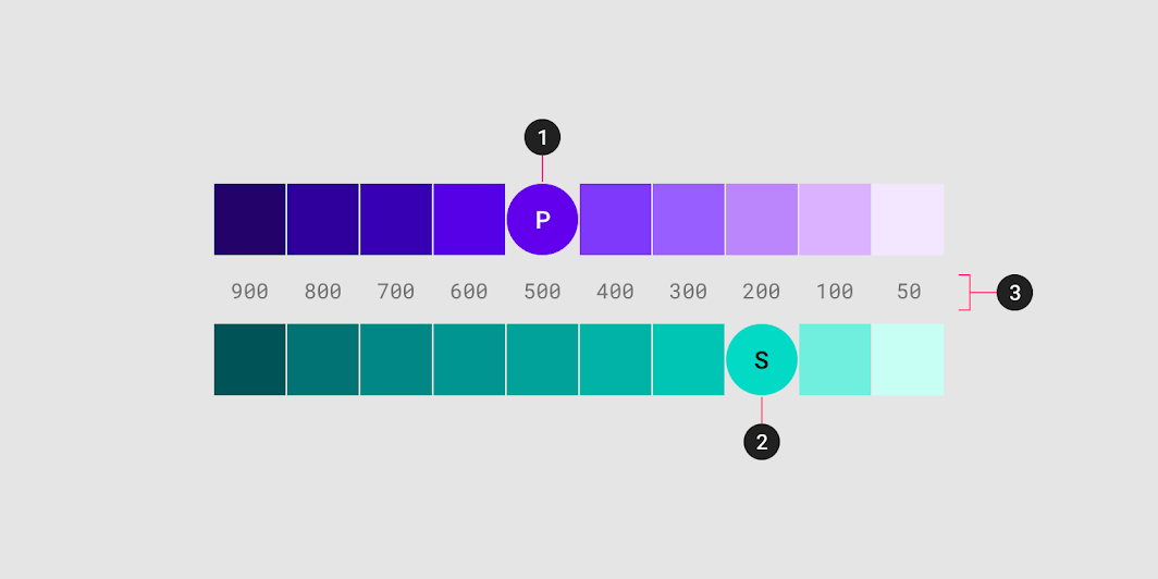
Image courtesy of https://material.io/
Design systems we love
To wrap up design system 101, we recommend browsing the web for examples of design systems. The following are notable design systems that our team of UX/UI designers has selected as benchmarks and inspiration.